Part 01
Overview
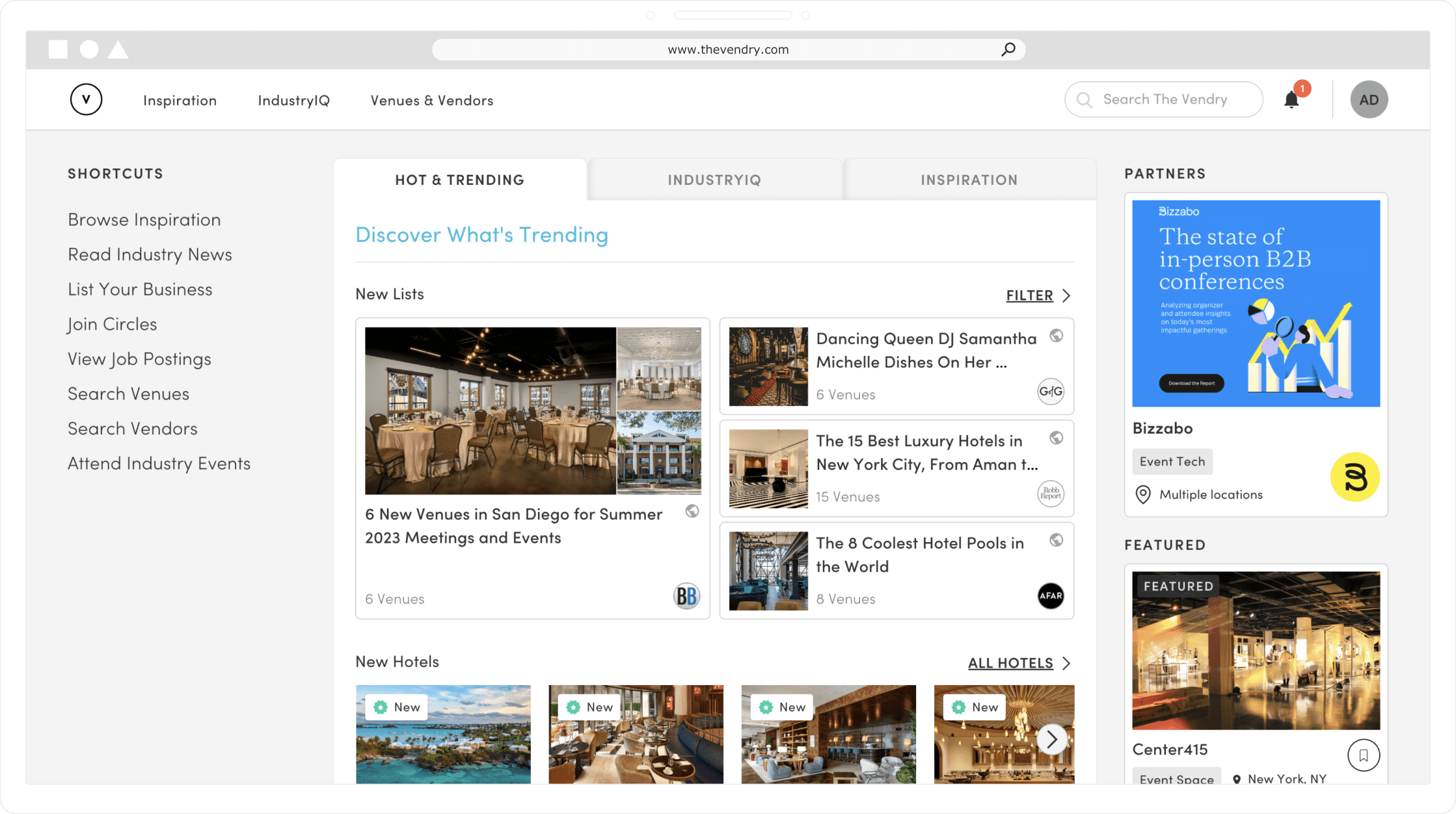
The Vendry is a web platform that lets event professionals source and plan events, connect with other industry peers, and leverage a marketplace to find the best venues and vendors for their next event. Its core users include companies, 3rd party planners, and non-profits.
As the sole designer on the team, I designed and shipped modern solutions for event professionals on the customer and enterprise side. I reimagined business and user needs into end-to-end prototypes, improving our current user experience, and iterating through enterprise solutions while working closely with our product, community, & engineering teams to craft industry-defining solutions.
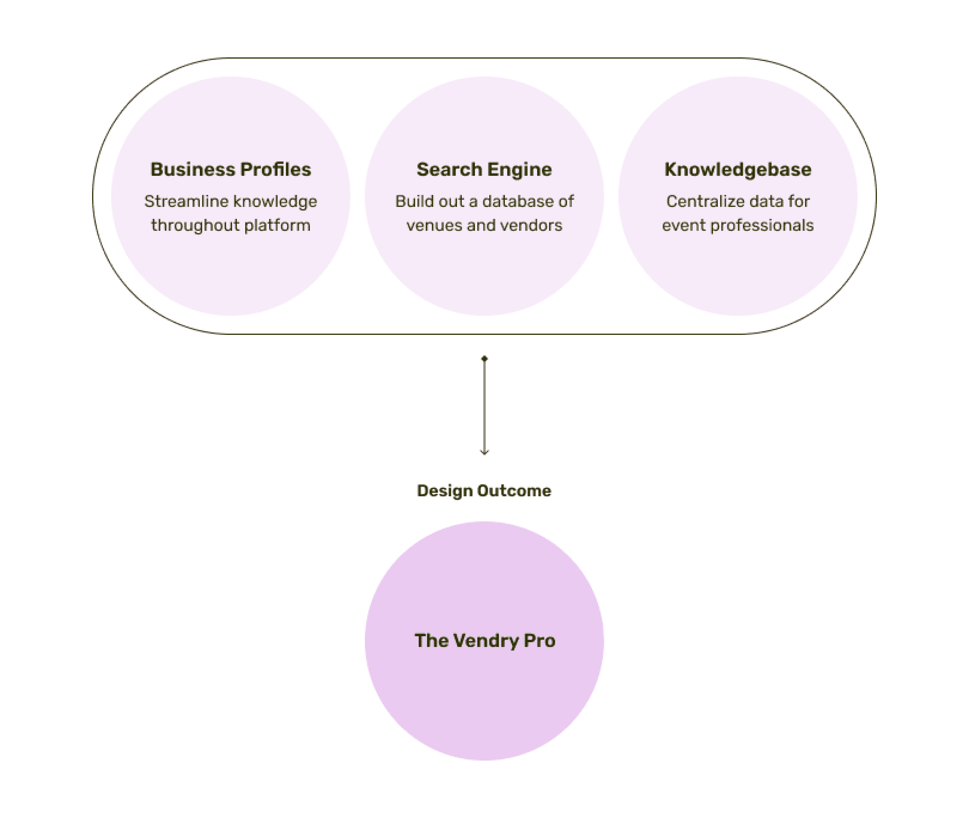
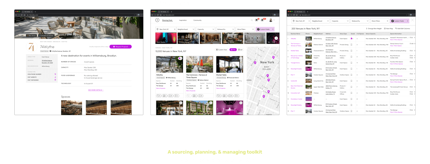
The Vendry Pro is a core milestone that strategically grew and defined our platform and service. It encompasses three main components, all aimed at streamlining and simplifying the event planning process on the enterprise user side.
The following three-part case study documents my process on what I did and how I achieved design and business goals.
We wanted to leverage unique searching, sourcing, and planning tools to target enterprise users and retain a consistent customer base. To achieve this, I distilled three problems that derived from business needs identified by our leadership team. These served as my focal points throughout the process when imagining what design solutions and formats best addressed the problems.
Current Event Professional Teams
There is no existing enterprise tooling to build out our platform's database on venue and vendor businesses
We need a way to streamline enterprise data on venue and vendor businesses throughout our platform
Enterprise teams need a way to centralize new and existing knowledge during the event planning process
We wanted to take on the challenge to scale our platform from a marketplace to a comprehensive events planning solution tailored for enterprise teams.
We recognized the importance of exploring monetization opportunities by leveraging specific features that offer a unique event planning experience to open up potential revenue streams. Another factor involved the significance of differentiating our value proposition within a competitive market. Furthermore, we identified the need to build out the platform’s database on venue and vendor businesses. This allows for comprehensive insights and would enable data-driven decision making in the future.
The Project Goal
Create an intuitive and streamlined experience for enterprise event professionals to consolidate and manage their information on venue and vendor businesses.
The Business Goal
Differentiate our position in the market by scaling while building our company's internal database on venue and vendor businesses through knowledge from event professionals.
As with any other project, I faced several constraints which needed to be taken into account throughout the process. Addressing these constraints required agile planning, ongoing communication, and frequent revisiting of our long-term and short-term goals.
01
Small team and limited resources
One of the key constraints was the size of our team and the limited resources available to carry out the entire flow from research to implementation. This required us to be efficient in our roles, utilize cross-functional skills, and prioritize tasks effectively to cover all aspects of the projects.
02
Fast-paced timeline
To efficiently optimize our resources and efforts, I took an agile process, allowing for rapid iteration, regular progress updates, and constant feedback. This allowed me to gain long-term clarity and prioritize tasks within a projected timeline.
03
Dealing with ambiguity
The scope and requirements of what we wanted to accomplish were initially quite ambiguous. These uncertainties resulted in pivots and stress-testing throughout the design process.
The outcome resulted in an end-to-end event planning and information managing service consisting of three integral experiences. To ensure a successful launch, we followed a phased approach and beta-tested with immediate key stakeholders. As of now, all features have been launched and are available on The Vendry.
If you want to continue learning more about my in-depth design process of each segment, feel free to continue reading or scrolling below:
Part 02
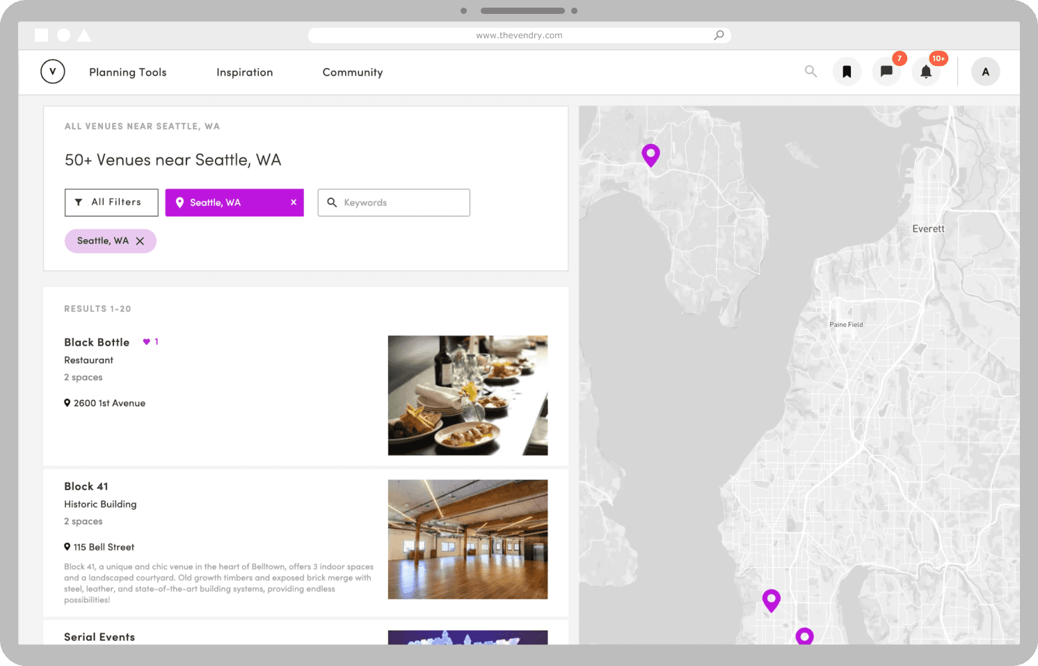
The Business Profiles
For the first segment of The Vendry Pro, the business profiles, this was my design process overview.
01
Discovery
Interviews and user research done by the community team helped me to understand the scope and goals
02
Ideation & Iteration
Design exercises and brainstorming were done with the team to define the look and feel of the user experience
03
Usability Testing
Rigorous user and usability testing were conducted with stakeholders to address edge cases in the project pivot
04
Design Outcome
Engineering handoff and accessibility adjustments were made to the final design before development
To kick off my process, I researched and scoped the current event planning landscape for pain points, existing tools in the market, and identifying areas of opportunity. Working closely with the CEO, PM, and community team, we conducted six user interviews, secondary research on competitors, and looked at user analytics through FullStory to identify the problem.
Stakeholder Insight #1

"It's difficult to keep track of our supplier history. We need a way to view cleaner data."
— Calon, Attentive
Corporate planning teams typically allocate a minimum of one to two months from the initial searching phase to the contracting phase
Stakeholder Insight #2
"When people leave or switch teams, we lose track of data and knowledge."
— Meighan, Amazon
Corporate planning teams want to have a unified information sharing ecosystem
The current event planning and sourcing process is outdated. There is no easy way to transfer information throughout the process, leading to information getting lost. This can take on in the form of stale spreadsheets, overwhelmed inboxes, and team changes which can lead to valuable information being misplaced or overlooked. These gaps in information flow lead to errors and unnecessary repeat of work, resulting in significant time waste.
Our platform analytics indicated that there was an opportunity for improvement regarding venue and vendor business profiles, which consistently emerged as top entry points for users.
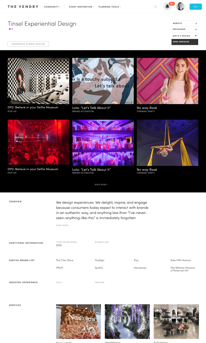
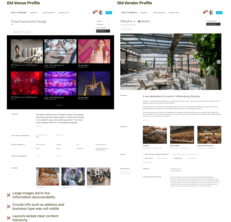
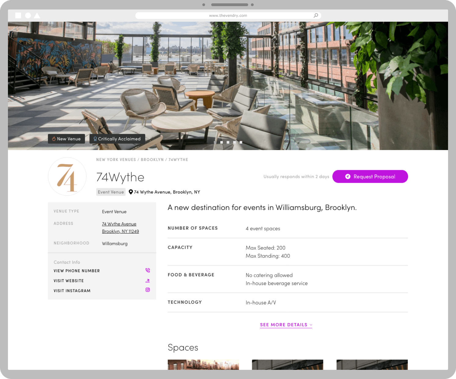
The previous versions of venue and vendor business profile pages were largely image-centric. While visually engaging, they made the task of locating crucial information a tedious and negative task for the user. This often led to users not taking any next steps, thereby negatively impacting usability and user retention.
Most notably, the previous profile designs lacked scalability, making them unsustainable for various use cases. For instance, when a business did not have enough pictures or related content for a user to see, this resulted in an underwhelming and unhelpful user experience.
How could we efficiently centralize and present information, allowing users to manage and view essential data about a business in one space?
01
Poor discoverability of helpful information
Our users were not finding the information they needed quickly or easily, which indicated a need to reevaluate how we organized the content on our business profiles. The goal was to refine the presentation and layout of information to ensure that users could locate the most key information with minimal effort.
02
Inconsistent design patterns across venues and vendors edge cases
Our previous business profiles had inconsistent design elements, creating confusion and usability issues. Addressing these inconsistencies and streamlining the design across different profiles was seen as a key step towards enhancing our user experience and improving platform coherence.
03
Low drive and incentive for users to take further meaningful actions
There was a low drive for users to explore more or take meaningful actions to see their event planning process through within our platform. This pointed towards a need to creating more engaging and compelling prompts and crafting more personalized experiences to motivate our users to take that next step.
The challenge presented revolved around the integration of internal enterprise data into our platform.
To improve overall discoverability, the first design pattern I considered was a sidebar navigation to keep content accessible. However, this approach did not adequately address the existing issue of information overload experienced by users. Subsequently, I explored the potential solution of drawer interaction patterns as a means to better organize and support expandable content. Again, this solution didn’t prove intuitive and it presented accessibility issues from a usability perspective.
Lastly, my ideation process led me to consider tab navigation. This design pattern appeared to best align with our business needs in terms of scalability and content flexibility. Following discussions and evaluations of my initial sketches and design ideas with the team, we identified the tab navigation concept as having the most potential. It most accurately met our project goals while providing value to our users.
How can we effectively and efficiently reimagine business profiles at scale to accommodate data integration?
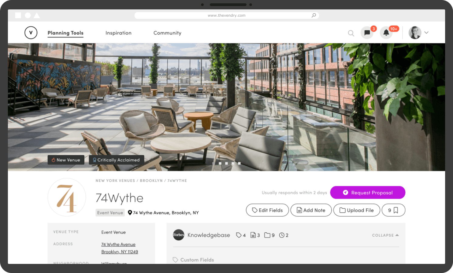
After observing user interactions on our old business profiles via FullStory, I identified the need for a comprehensive overhaul of the content hierarchy to improve usability. As a result, I standardized key business information and established a more dynamic page layout to incorporate enterprise knowledge.
By working with our community team and CEO, I discovered that the most sought-after information during the initial phase of event planning was location and a means to contact or interact with the business.
After revising the tab navigation direction with the team, I could start to visualize an early-stage framework for enterprise data at scale.
Mid-Fidelity Wireframe
After Team Feedback & Iteration
Due to the project’s high priority, we aimed to launch the redesigned business profiles for venues and vendors on an urgent timeline. As a result, I wanted to finalize a design solution as soon as possible.
However, once the new designs were launched, the product team and I quickly identified major usability issues during user testing. We found inconsistencies in the presentation of information, which impacted scalability across various edge cases. For instance, businesses with longer names created unnecessary white space, impacting the visual balance and readability.
Furthermore, it was evident that users were unclear about the enterprise functions that allowed them to add content, such as notes and files. This prevented effective usability and engagement potential.
Based on the usability issues we encountered, it became apparent that I needed to realign our design goals and strategy. Taking a step back and revisiting my design objectives allowed me to focus on our core goals and define what I wanted to solve for our users.
01
Create a scalable design model for business profiles
The goal was to develop a structure for venue and vendor business profiles that was both robust and adaptable. I needed to accommodate a wide array of business types and sizes, without compromising the user experience and interface intuitiveness. This scalability was key in ensuring my design could evolve alongside the business landscape and user needs in the future.
02
Design the foundation for an enterprise-specific system
Simultaneously, I clarified my direction of creating an experience for corporate event professionals, a significant user group that we wanted to grow on our platform. Designing enterprise-specific tools and features that cater specifically to their needs would thereby drive further engagement and user satisfaction.
By refocusing my design objectives, I were able to navigate the complexities and pivots of the project with a clear and strategic direction.
Working against a tight deadline, I extensively redesigned the business profiles through insightful conversations with our CEO and the engineering team by keeping the design of the information accessible and direct. To address the challenge of information overload, the engineering team and I decided to establish standardized rules for the presentation and handling of enterprise data on the backend. More importantly, this was accomplished without compromising the depth and richness of content provided on our business profiles.
I rigorously stress-tested the revised business profiles to ensure scalability across all potential edge cases. Upon reflection, I think the root of this issue stemmed from our late-stage consideration of real enterprise data in the design process. I didn’t include actionable incentives for users to build their enterprise knowledge until the much later stages of development.
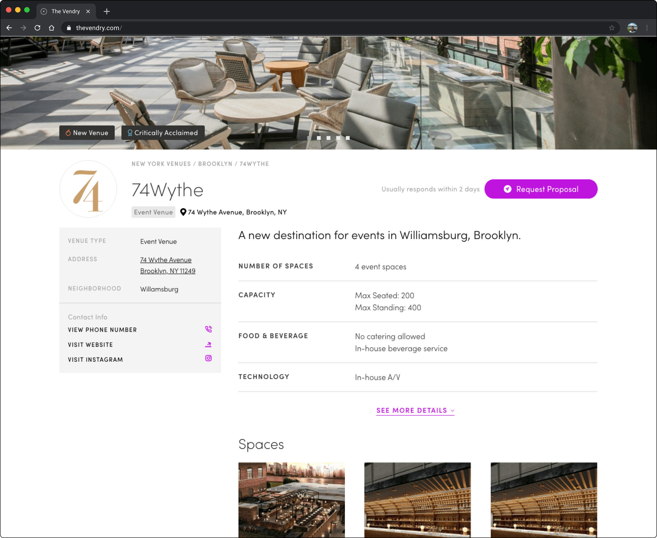
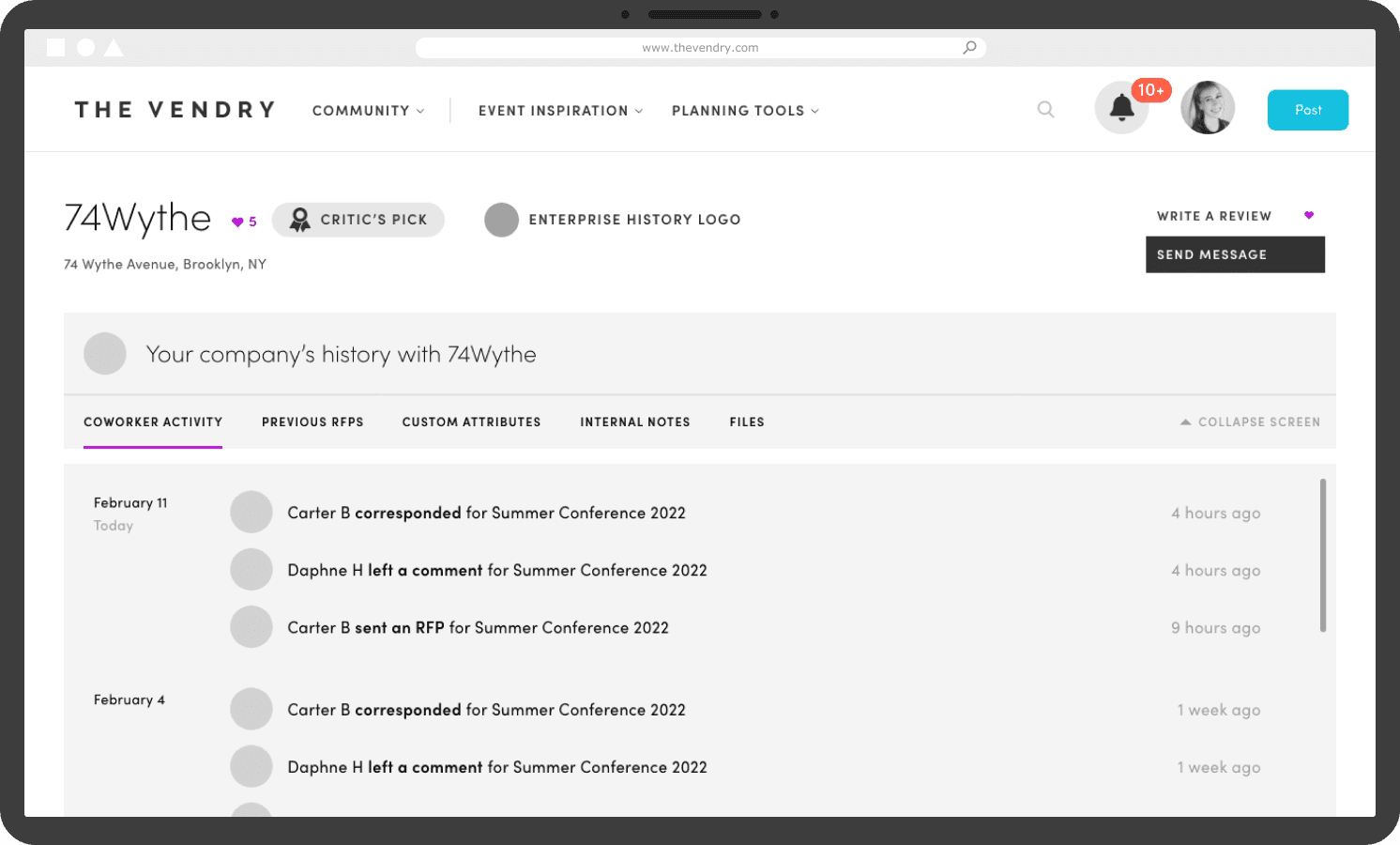
The final outcome was a redesigned, cleaner, and simplified business profile that served as a template to scale to various venue and vendor information. The streamlined design made more efficient and effective use of space and helped guide users towards relevant actions, improving user retention and the overall experience. At a macro level, this redesign improved our platform’s SEO ranking of businesses and the scalable design provided our engineering team with a consistent structure, streamlining the development process.
Old Design
Final Redesign
In sum, the following key improvements were accomplished.
01
Establishing standardized rules for managing enterprise data
We established a set of standardized guidelines to manage and represent enterprise data across our platform. As a result, the arrangement of enterprise data across different areas of our platform was more reliable, providing users consistent information that met their expectations.
02
Designing at scale for venue and vendor edge cases
My tight timeline to pivot the project due to usability issues throughout the process led to a reworked design that accounted for the various edge cases we might encounter, ensuring a unified design language. This not only created a more seamless experience across various venue and vendor profiles, but it also assisted our engineering team in the design and development process.
03
Improving visual hierarchy and use of space
A more effective use of space and redesigned visual hierarchy improved content visibility and intuitiveness. Through strategically thought-out layouts, I was able to optimize the purpose of different content presented. This improved users’ abilities to quickly and easily locate the information they needed, facilitating a faster venue and vendor sourcing process.
04
Introducing clarity on CTA’s
The final redesigned business profiles reduced ambiguity among our users, leading to noticeable improvement in engagement metrics. The new profile designs also minimized the occurrence of error-clicking, contributing to a smoother and more enjoyable browsing experience.
05
Setting strategic inclusions for SEO improvement
The strategic inclusions of SEO-friendly elements such as breadcrumbs not only improved site navigation but also contributed to our SEO efforts. As a result, our platform’s visibility on search engines improved, leading to increased organic traffic and improved engagement analytics through multiple entry points.
Part 03
The Search Engine
For the second segment of The Vendry Pro, the search engine, this was my design process overview.
01
Discovery
User research and market research were conducted to pinpoint the user problem and identify areas of opportunity
02
Ideation & Iteration
Search UX was defined after validating design directions and iterating based on team feedback
03
Design Outcome
Stakeholder interviews were done to assess initial reactions and address feedback before handing off to engineering
We needed to be able to cohesively streamline enterprise team data throughout our platform.
After laying the foundation for collecting more business data and offering corporate event teams a way to consolidate their information, our team faced a new challenge.
By looking at user behavior data, I saw that there was stagnant growth on our search results pages. This led me to understand the importance of incentivizing user action and driving traffic towards the redesigned business profile pages.
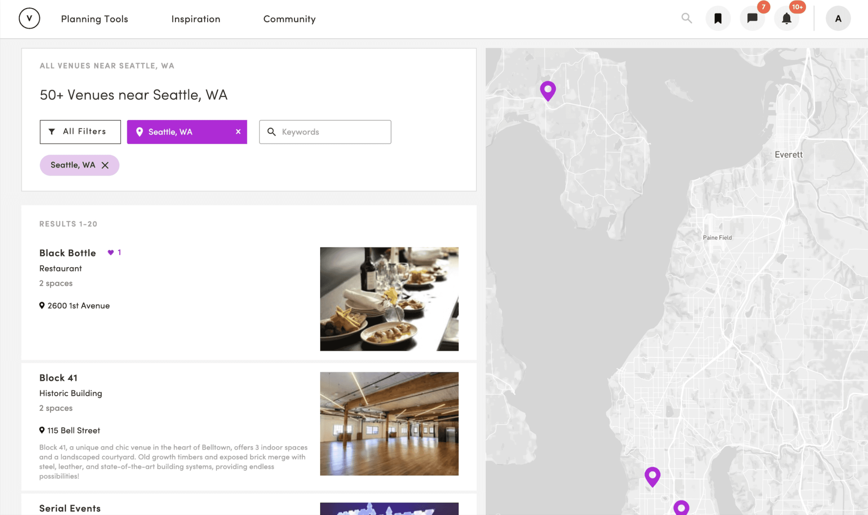
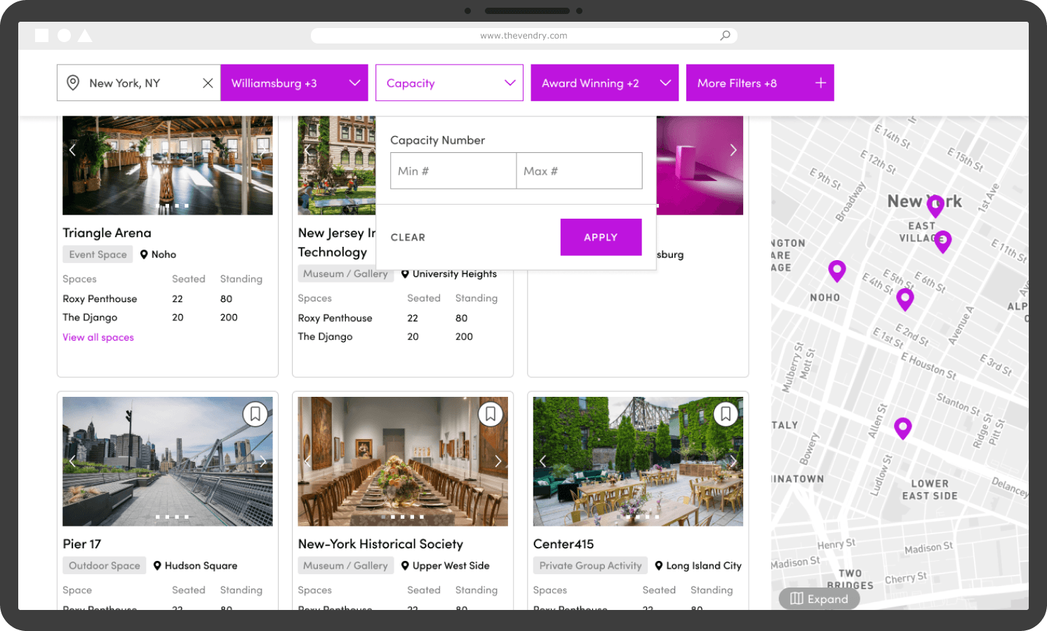
To provide more context, users rarely engaged with venue and vendor results after the first three on our search results pages, contributing to poor user retention. This lack of engagement could be attributed to the low discoverability resulting from hidden filters and the existing layout design.
Moreover, we needed to find a way to indicate enterprise-related information on our search results pages to target the goal of integrating enterprise knowledge with our platform’s data. I identified an area of opportunity to redesign our previous search results pages to better help users find the information they need and facilitate the event planning process.
How can we facilitate a connected discovery experience for event professionals?
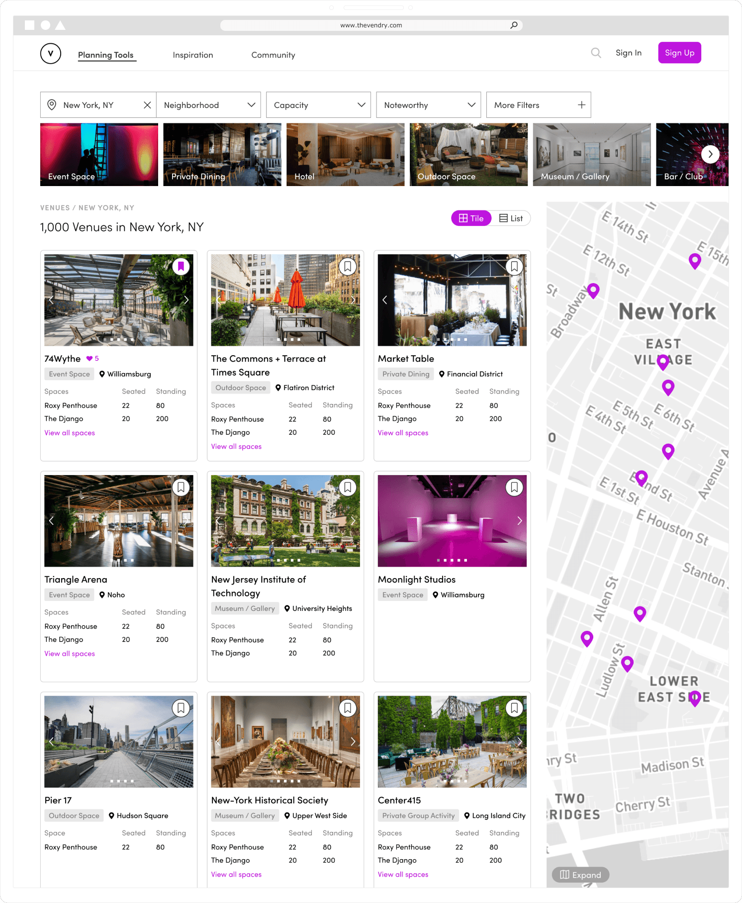
Old Search Page
Poor discoverability of venue and vendor profiles
Design lacked meaningful engagement metrics
01
Stagnant growth on our SERPs
Based on our platform analytics, the engagement time and number of unique visitors were not showing any promising signs of growth, signaling that our previous SERP page design was not effectively serving our users’ needs and expectations.
02
Unhelpful presentation of information
Our leadership team flagged the usability issues in the unintuitive presentation of information which was not helpful for event professionals searching for venue and vendor options.
03
Low discoverability of relevant results
The filtering and sorting functions were not adequately reflected the appropriate results for users’ search queries, leading to lower satisfaction and a decrease in user engagement.
04
Absence of clear indicators for enterprise data
Our search page was lacking clear indications and actions for enterprise data. We had no design solution for users to identify and access enterprise-related information. Therefore, enhancing the visibility and accessibility of enterprise data became a leading goal in my design process.
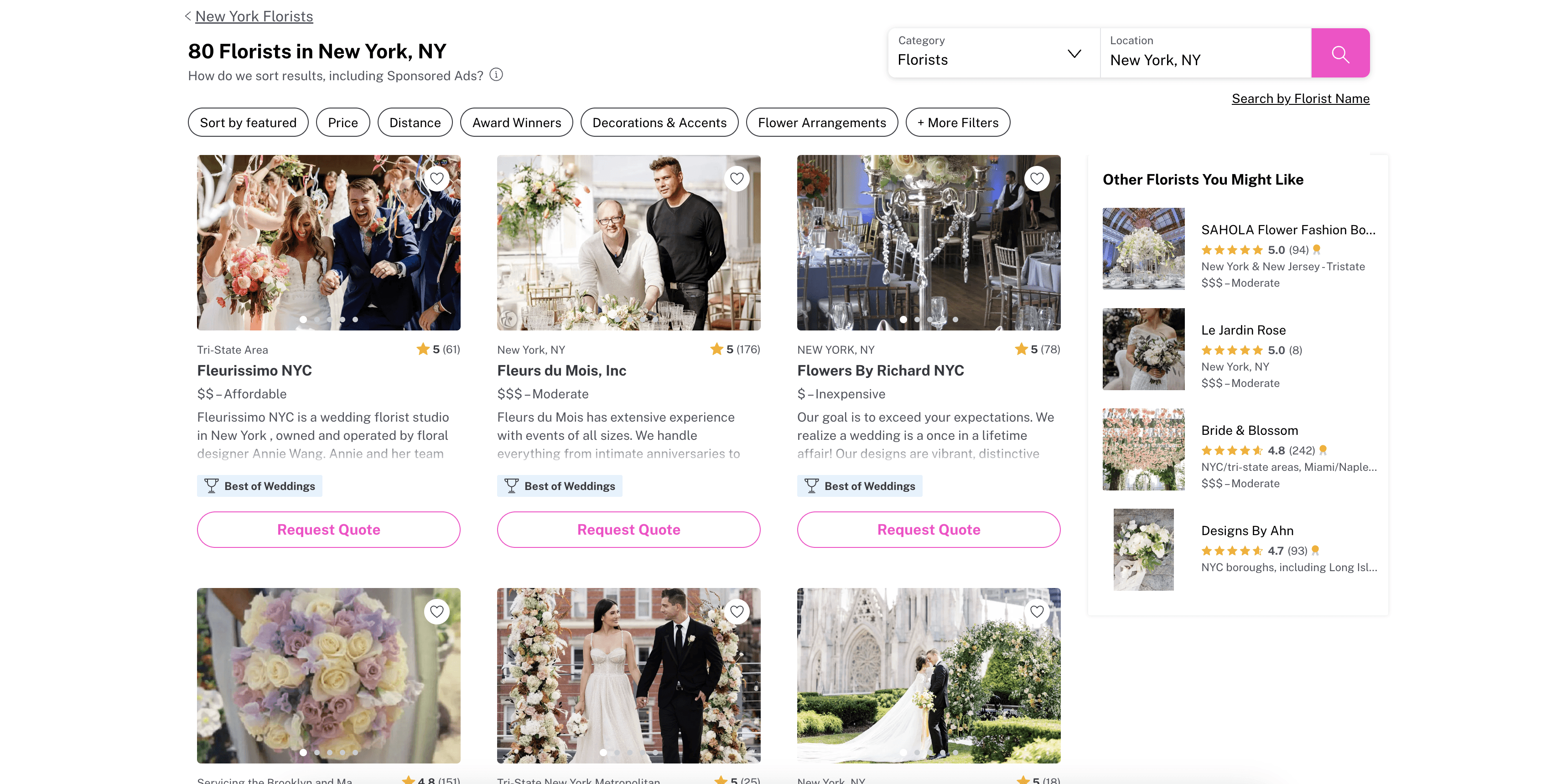
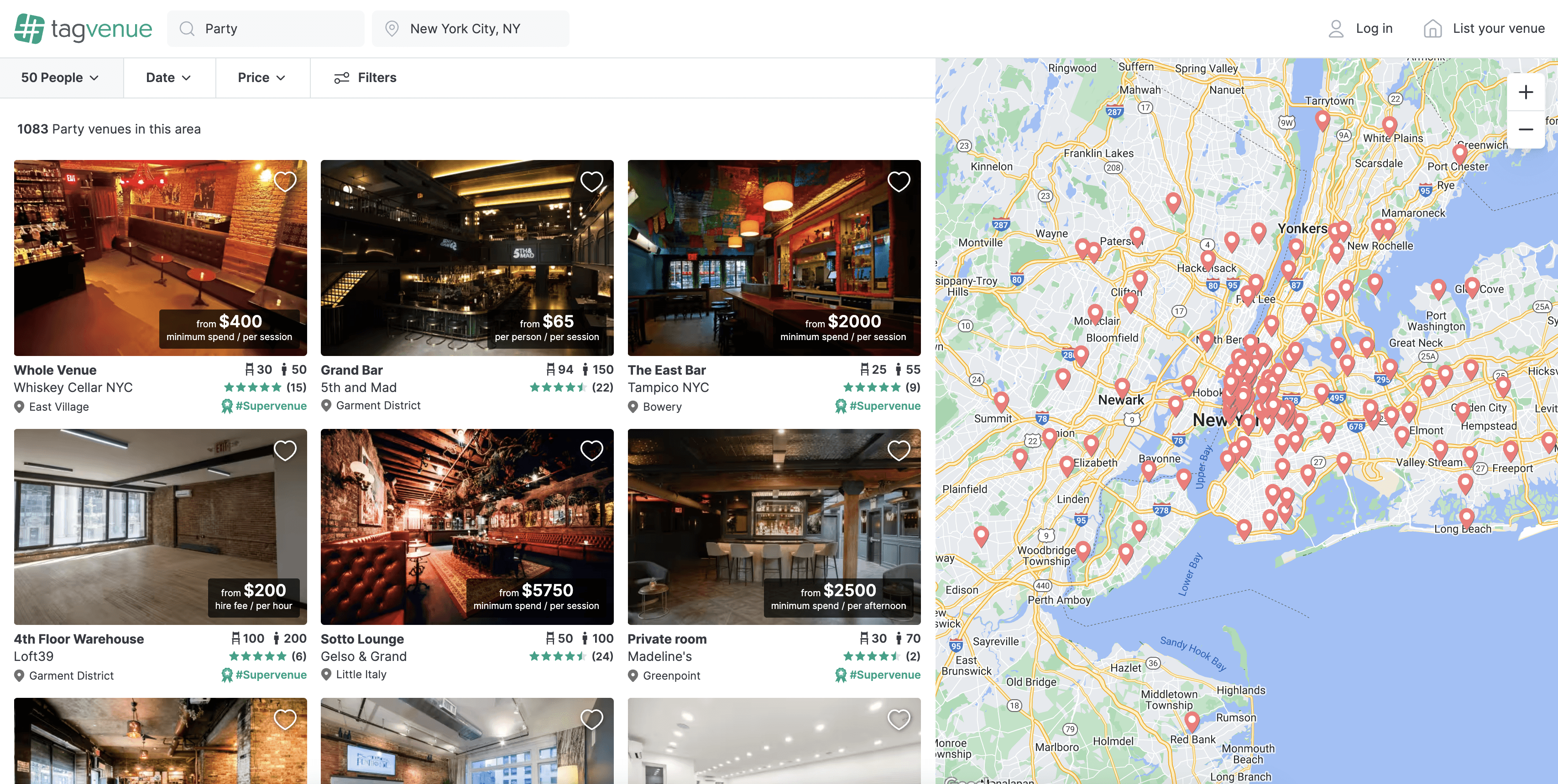
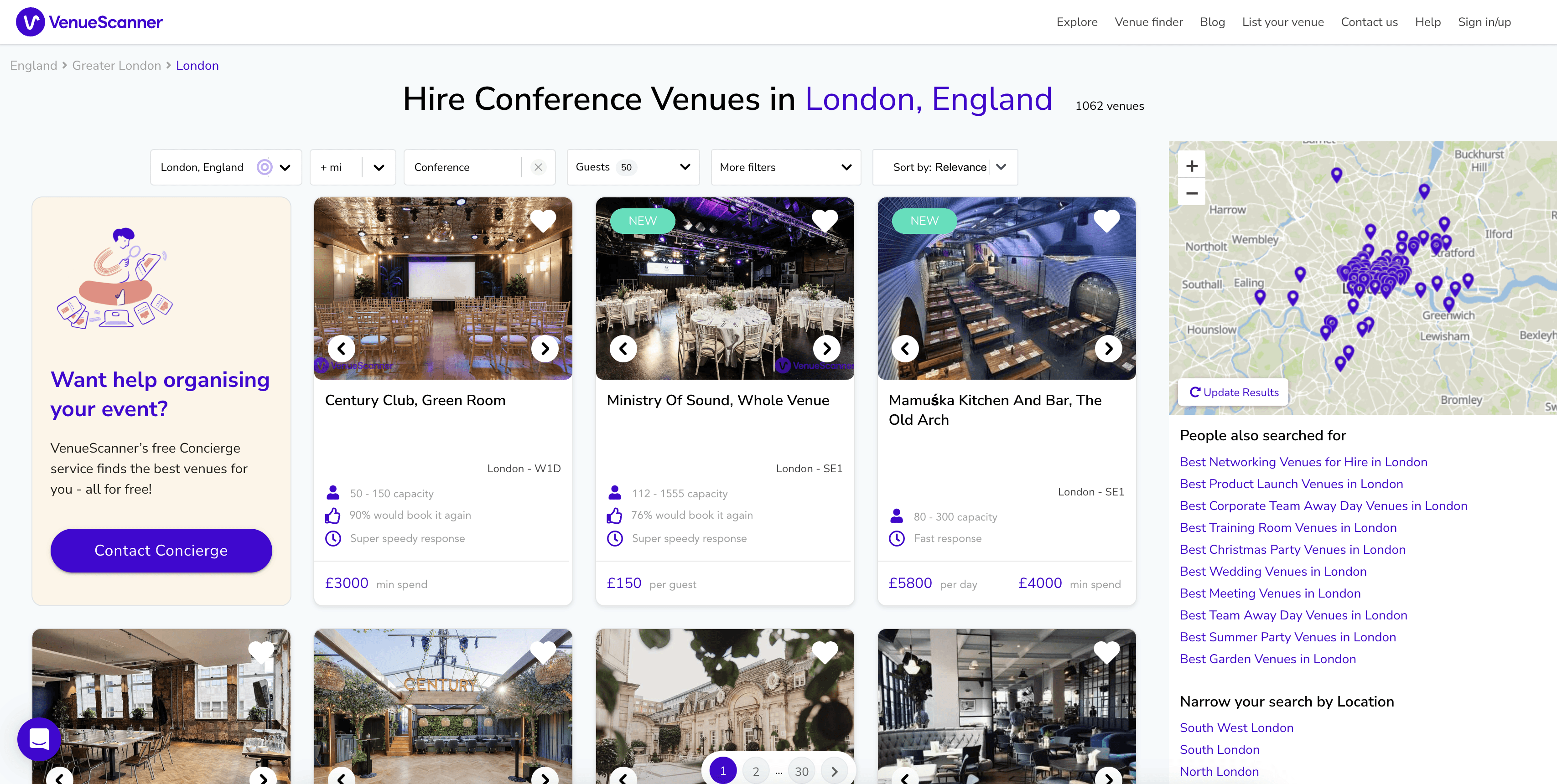
One of the first steps in my design process focused on examining competitor platforms in the market to identify common patterns, note design successes, and understand effective strategies regarding a search results page. I analyzed platforms such as Airbnb, The Knot, TagVenue, and VenueScanner, each representing unique design approaches in a search page experience.
A key insight was the effective content hierarchy observed in individual search results. It was interesting to takeaway the different placements for text and imagery to draw emphasis to certain actions or information. For instance, I noticed how strategic placement of visuals next to key details guided users to take important next steps. Another notable observation pertained to the organization of filtering actions, which created efficient searching and browsing experiences. Platforms such as TagVenue and Airbnb showed thoughtful design choices by placing filters in clear and accessible locations. This approach not only saves users valuable time but also provides a positive and effortless experience.

The Knot

Tagvenue

VenueScanner
In our analysis of user behavior data from our old search page, we saw that users often fixated on a single static view. Here, I saw an opportunity to enhance user retention and significantly extend our users’ discovery of venues and vendors.
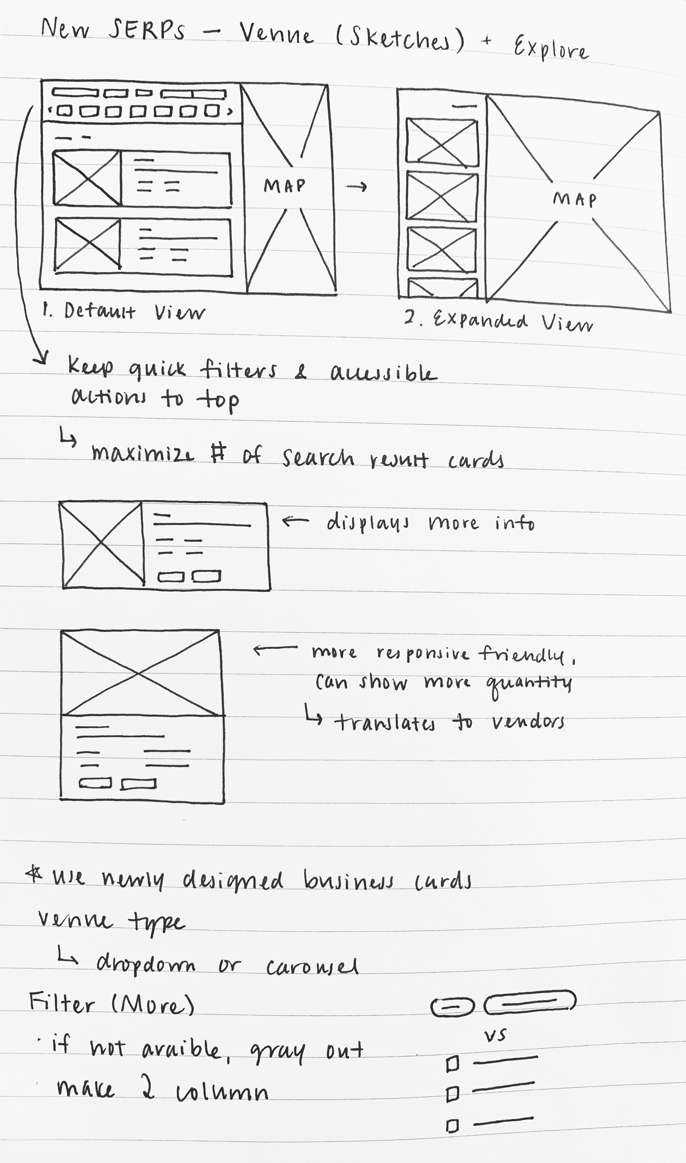
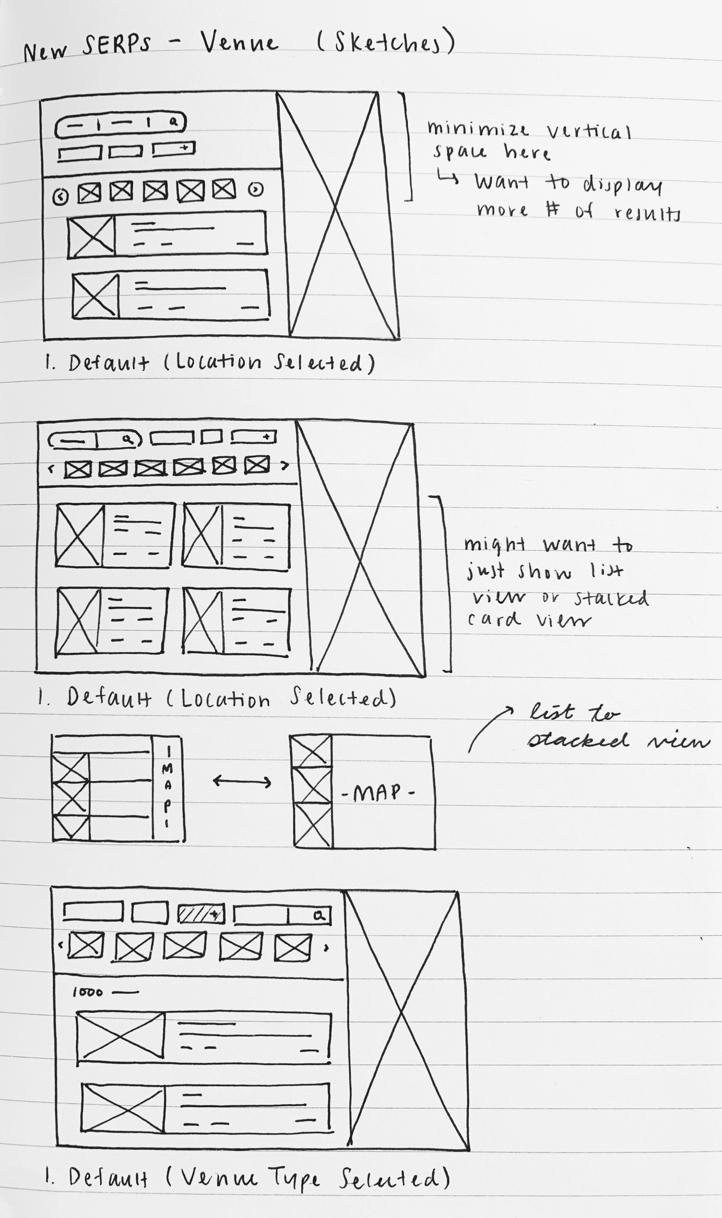
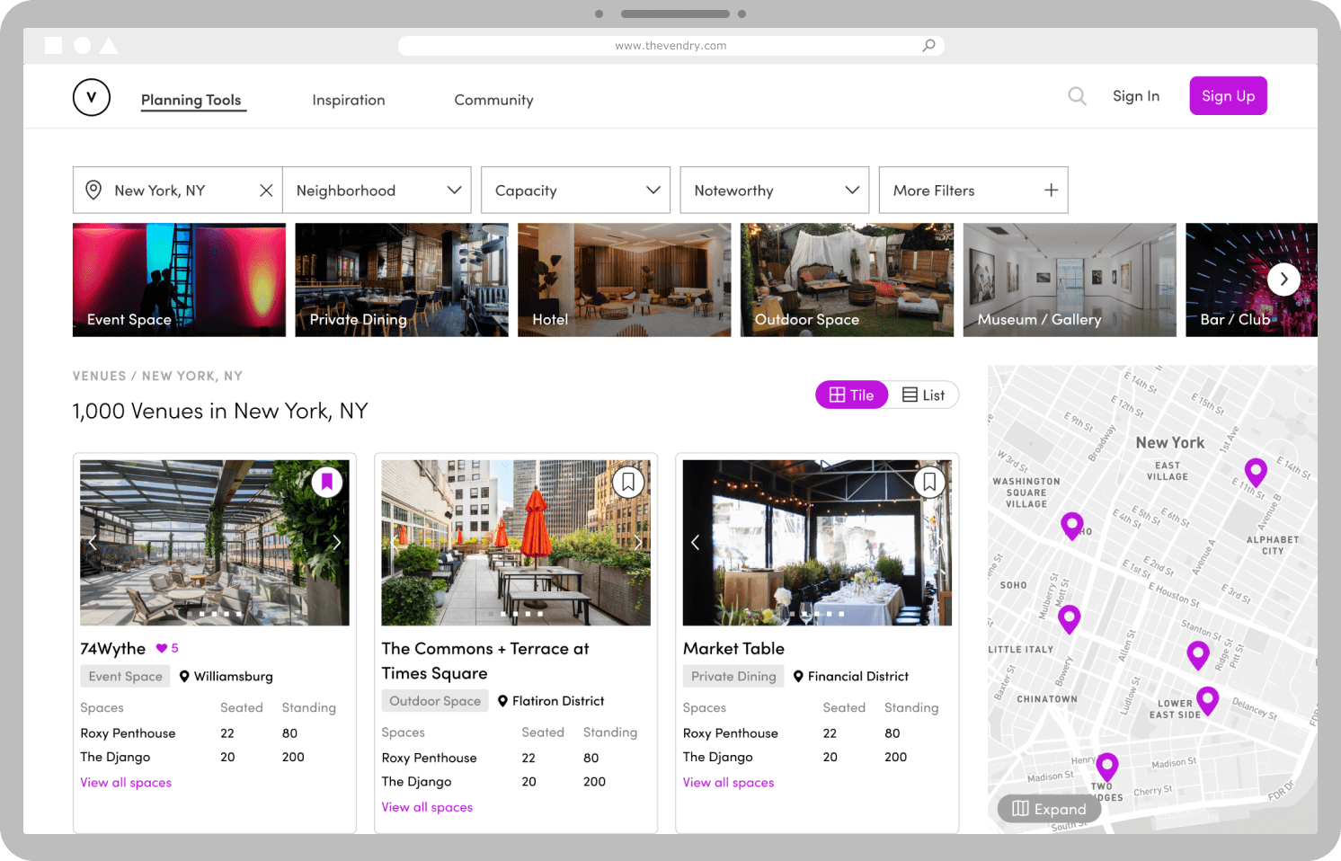
With these insights in mind, I explored design directions informed by the project goals and pain points. The first focused on a ‘split view’ concept, providing users with a multi-tasking browsing experience. The second centered around a ‘tile view’ layout, promoting a visual-first discovery experience. Specifically, encountering an aesthetically pleasing search experience in the planning process was a factor highly valued by our user base according to the feedback and user research we had conducted.
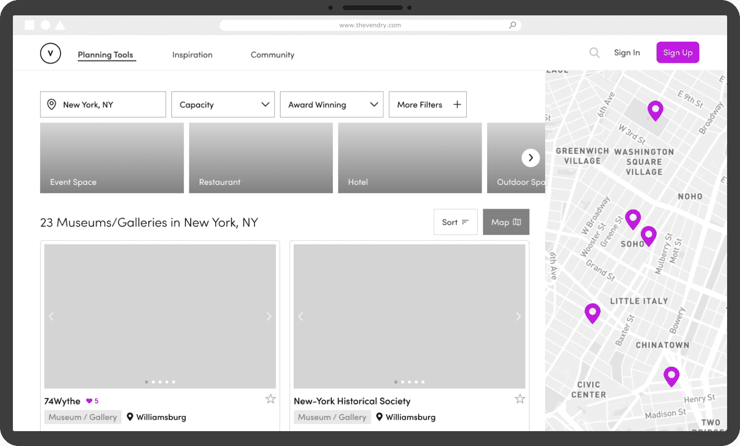
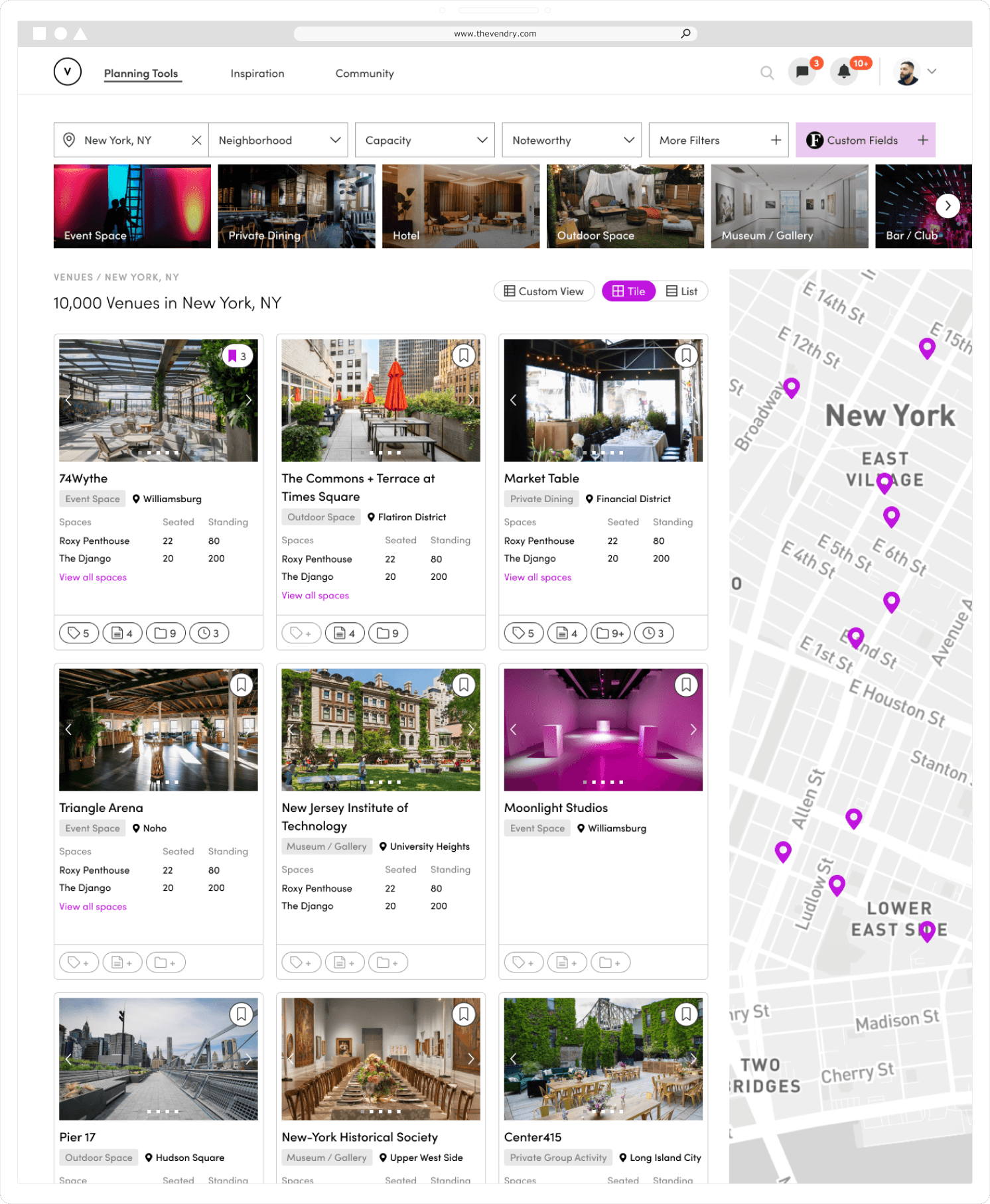
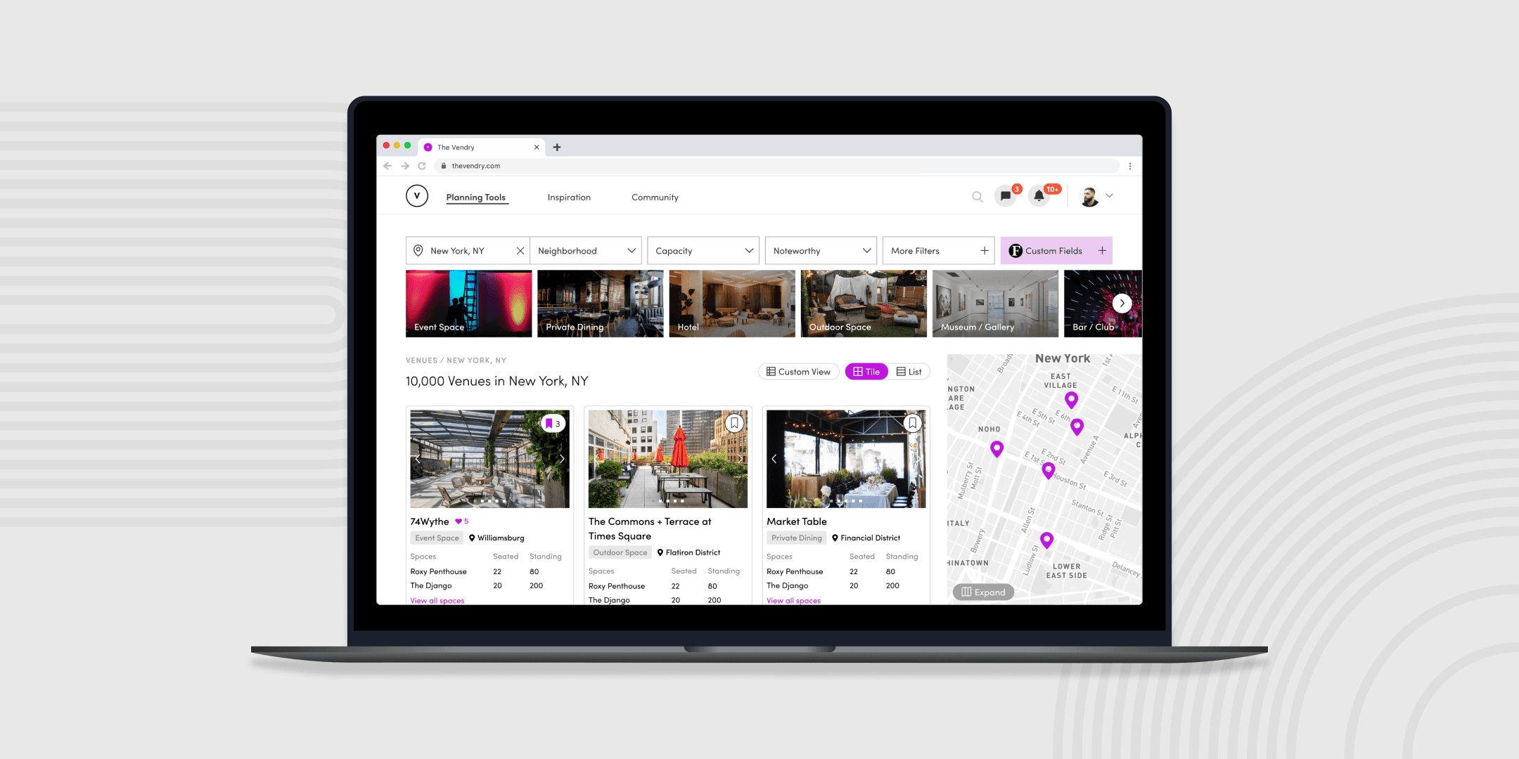
After presenting my sketches to the team, I combined the two design approaches. My primary goal was to improve both engagement and usability of our platform’s search experience. To achieve this, I increased the number of results displayed and improved the visibility of filter options to the user while balancing information density. Moreover, I incorporated visual cues of company-specific information through icons to integrate enterprise knowledge throughout the platform. These changes were made to provide a comprehensive and intuitive search experience to boost overall page engagement.
During my initial feedback, team members questioned the need and value of offering a list view to our users. Based on user research and user behavior data, I saw that incorporating an alternative layout option could adapt well to responsiveness, especially with the inclusion of a map interface. This aligned well with my design goals for this project and didn’t require a high technical effort. By including both the list and tile views in my design strategy, I aimed to provide a dynamic browsing experience to encourage the discovery process and boost platform engagement.
In addition to conducting user testing sessions via Google Meets and Zoom with various stakeholders, we also leveraged the power of digital communities that our platform has built over the past year. Specifically, we utilized Slack channels as a quick and asynchronous way for gathering initial reactions, comments, and suggestions about my preliminary design concepts.
From this comprehensive feedback gathering process, I gained significant insights into the preferences and needs of our enterprise users. One takeaway was the appreciation for visual details related to the specific businesses on our platform. The inclusion of such information served as an indication of past interactions, providing enterprise users a sense of context and history.
Stakeholder Insight
"I see this not as a replacement, but a way to supplement the event planning process."
— Tori, Noom
Enterprise users appreciate seeing the details related to their internal knowledge and process
From what I learned during feedback, the specifics of user interactions and the presentation of search results that are tailored to a company’s internal knowledge were crucial in achieving a streamlined information ecosystem. This indicated that personalization and relevance of data was key.
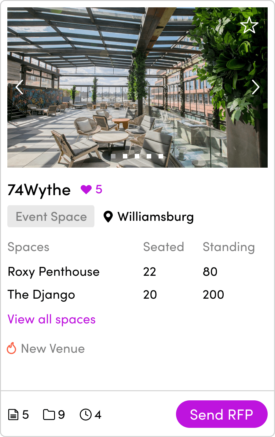
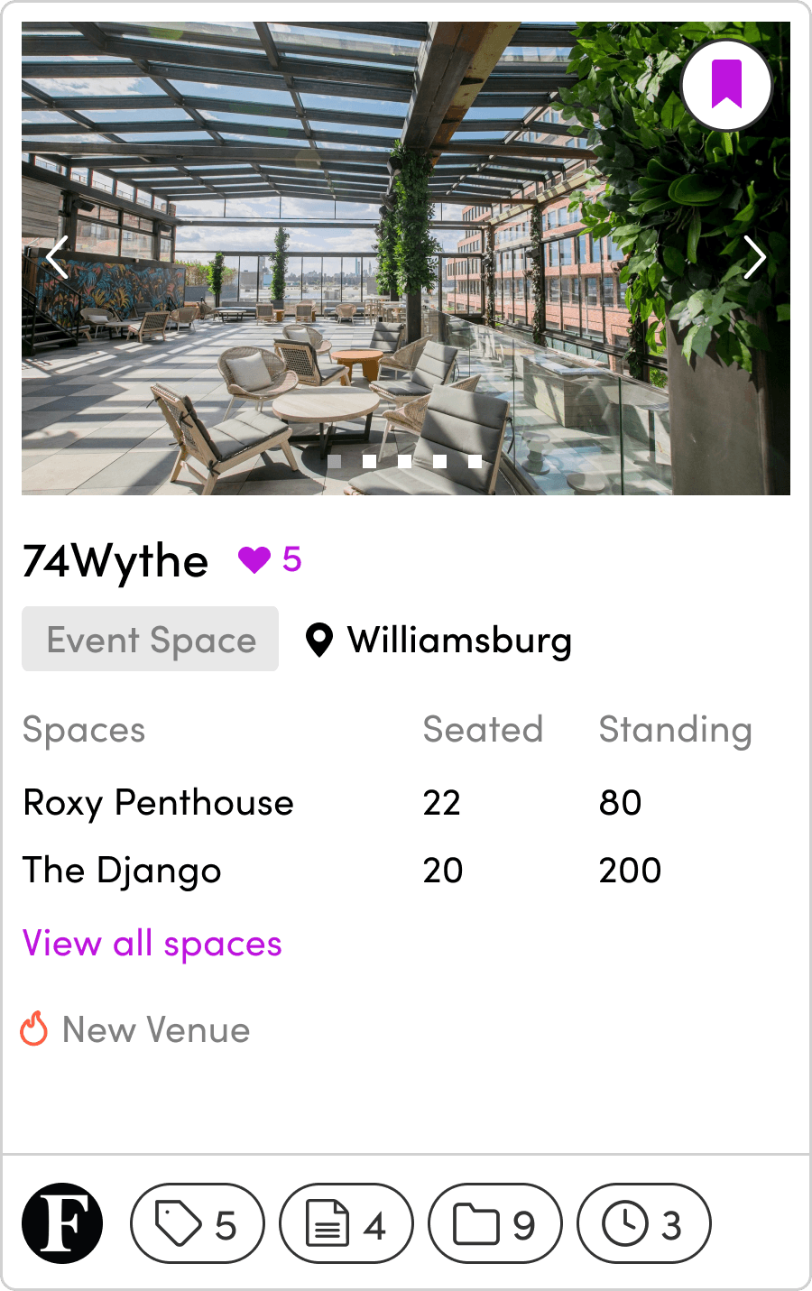
In discussion with my team members, I iterated on how we could optimize the presentation of individual venue and vendor business results. For instance, I observed that the earlier iterations failed to make enterprise indicators intuitive and actionable. Furthermore, overloading information onto the user was not only diluting essential data but also overwhelming the user.
With these insights, I explored ways to reduce potential errors and create a user-friendly experience. My final design aimed for a balanced approach that prioritized simplicity without compromising comprehensive, valuable information. This approach was designed to cater to the specific needs of enterprise users and deliver a unique and enriching experience.

Final Card Design
Card length shortened
Enterprise actions kept simple
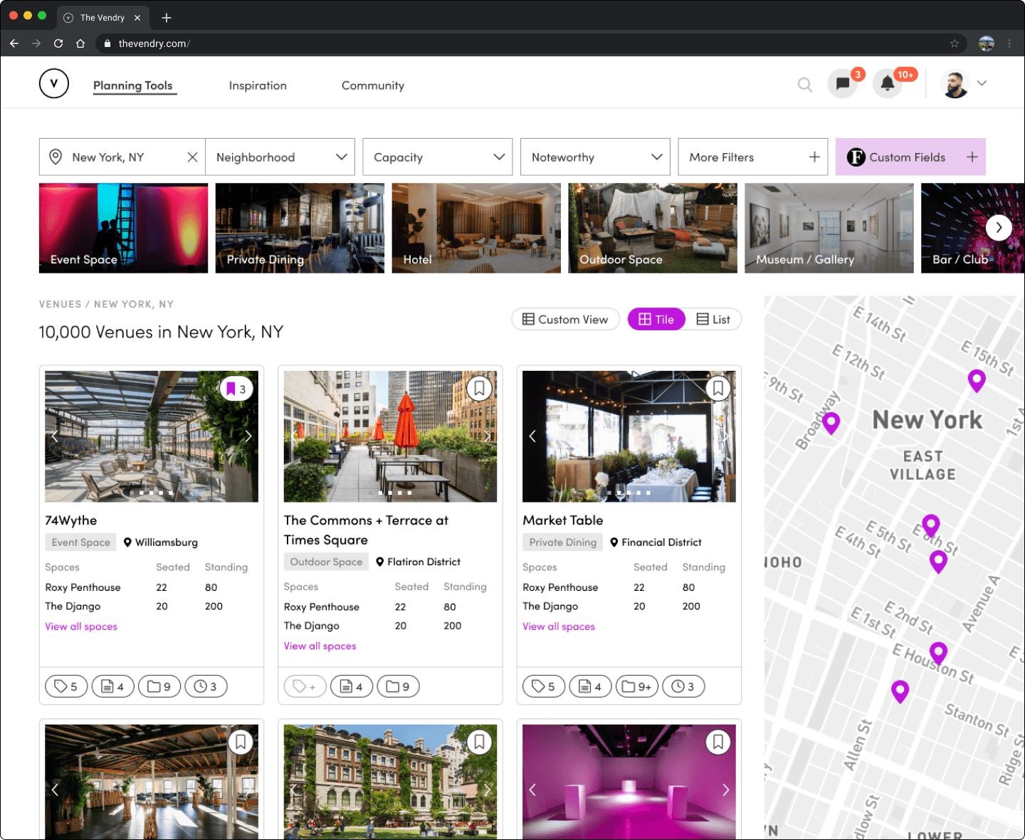
I achieved my project objectives by designing a way to integrate enterprise data with existing businesses on our platform through a comprehensive overhaul of the search result experience. My efforts centered around addressing user behaviors and needs extracted at the beginning of my process. With an updated redesign, we saw improvements in user completion and retention rates, evident through usage data. The final outcome resulted in a much needed and refreshed SERPs that enhanced usability and clarity, making the discovery and browsing process for event professionals more intuitive and engaging.
Following the user insights from my business profile redesigns, I ensured the display of enterprise data was consistent across all search result pages and the site architecture. This would ensure a seamless user experience, help event planners make meaningful connections between different data points, and foster a deeper understanding of enterprise-specific knowledge to facilitate the event planning process. This approach validated that throughout every touchpoint, from the search pages to business profiles, my designs delivered a user-centric and cohesive experience.
Old Design
Final Redesign
Search & Filter for Venues and Vendors
In sum, the following key improvements were accomplished.
01
Enhancing task efficiency
One of my primary aims was to improve user efficiency in completing tasks on the search results pages. I wanted users to effortlessly locate the information they needed to reduce their time investment, which is a critical consideration in the event planning process. To achieve this, I simplified the navigation to display the most important filters, streamlined information retrieval, and improved the overall performance of search functionality.
02
Optimizing layout and visual hierarchy
I utilized page real estate intentionally and establishing a clear visual hierarchy. My goal was to present information in a structured manner, ensuring it was not only well thought-out but also digestible. I focused on highlighting useful content, guiding the user's attention to important elements first, and structuring secondary information to be accessible when needed.
03
Boosting accessibility and discoverability of enterprise Information
I set out to make essential icons, buttons, and navigation cues visible and intuitive, which were finalized through rigorous rounds of iteration in the design process. Furthermore, I crafted enterprise indicators with a modular framework in mind so that the design would adapt accordingly to non-enterprise users as well. This was all achieved in the service of crafting a more dynamic, efficient experience.
04
Ensuring design consistency across venue and vendor cases
Consistency was another focal point for me. I wanted to ensure that whether a user was browsing for venues or vendors, the layout and functionality would remain consistent. My goal was to minimize potential confusion and facilitate a smooth experience from one page to another. In this respect, I focused on maintaining uniform design elements, interaction patterns, and stylistic choices.
Part 04
The Knowledgebase
For the third and final segment of The Vendry Pro, the knowledgebase, this was my design process overview.
01
Scope & Research
Interviews and user research were led to set core goals, design principles, and project tasks
02
Design Exploration
Rapid brainstorming sessions and ideation were done to visualize the overall experience
03
Testing & Iteration
Comprehensive feedback sessions held with the team defined specific product interactions
04
Delivery
Content and accessibility were finalized and assets exported to developers
The Vendry revealed a notable gap - we lacked a solution that enabled enterprise teams to compare information about different venue and vendor businesses. Why was this important? From what we gathered through user research, spreadsheets played a significant role in the event planning process, specifically when it came to sourcing venues or vendors.
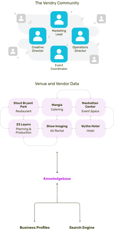
It was clear that we needed a design solution that could centralize and align external enterprise data with our platform’s internal data. This would not only address our users’ needs but would also bring a unique value proposition to the market. At its core, my goal was to lay the groundwork for a comprehensive, enterprise-centric system and tooling that would maximize team productivity and enhance knowledge management.
To create a connected product experience, we needed to find a way to centralize enterprise team knowledge.
Merge external enterprise data with internal platform data for strategic alignment
Establish a reliable foundation for an enterprise-specific system and tooling
Minimize the time and effort dedicated to collecting and managing business information
Diving Back into User Research Again
Diving into user research again, the community team gathered nine event planning spreadsheets from various corporate event planning teams and I carried out secondary research on competitor platforms to draw inspiration and identify successes and pain points. Throughout this process, I distilled two key insights to help inform our design outcomes.
Corporate event professionals care about refining their overall planning process and staying updated with the most recent data
Corporate event professionals use multiple softwares to consolidate information - resulting in a clunky, inconvenient, and time-consuming process
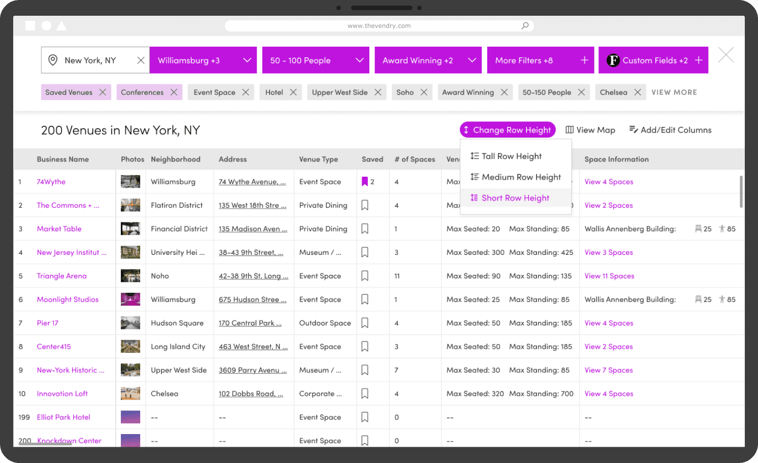
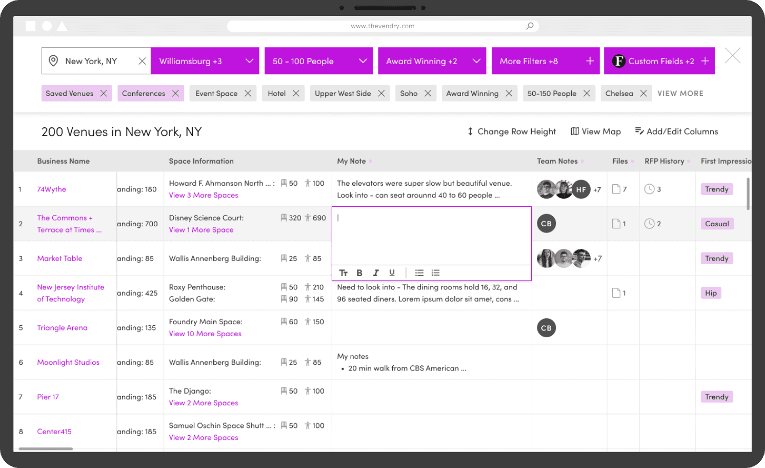
My initial concept was to build off of the redesigned search page because I intended this to serve as a convenient solution for users to interact with a lot of information. I gravitated towards a grid format, mirroring the familiar interface of spreadsheets often used by event professionals. Specifically, I aimed to address a key pain point from user research, which was the issue of navigating multiple softwares.
After presenting my initial concept to the team, I received mixed reactions. The integration of a spreadsheet interface within a search and filtering page was unintuitive and introduced major technical limitations. However, following my discussions with the product and engineering team, I concluded that it would be more viable to develop this tool as a full-screen experience. This approach could accommodate and adapt more effectively to extensive amounts of data while still aligning with my strategic goals.
How might we design a comprehensive data management tool that is both valuable and technically feasible to event professionals?
Initial Design Concept
After Team Feedback & Iteration
My design strategy centered around a key insight that emerged during user research: the importance of detailed data visibility. Through productive discussions with team members and fine-tuning design components, I included features such as adjustable row heights and in-cell editing. This transformed my design from a static interface into a dynamic, interactive workspace, thereby offering users the flexibility they needed to manage business-related data.
To validate my designs further, we conducted user testing and usability sessions through stakeholder calls. The surprisingly positive responses reinforced my design choices. Specifically, users appreciated the ability to compare information about businesses in a clean and more visually pleasing manner. Furthermore, I received feedback that this was a valid improvement from the cluttered spreadsheets event professionals are used to. The success of these stakeholder demos and feedback reflected the effectiveness of my iterative design approach and validated the vision to deliver a comprehensive, productive tool to reality.
Edit Row Height Feature
Expand Map View Feature
In-Cell Editing Feature
The essence of The Vendry Pro was the creation of a knowledgebase tool designed to streamline workflows and reduce redundant work by leveraging the insights and data collected by enterprise teams.
This tool enables enterprise teams to curate custom views of preferred venues and vendors, tailor their database using custom fields and tags, share notes internally, and store relevant notes and files. All of these features encompass a dynamic and personalized experience, simplifying the complexity of managing vast amounts of information.
After user testing, feedback indicated that our design solution facilitated a more efficient and visually pleasing way for storing, searching, and accessing necessary data in real time. This not only relieves the pain point of managing multiple spreadsheets and softwares, but also improves efficiency by giving users the tools to search and share data.
The introduction of this knowledgebase tool has had a valuable impact on how event professionals handle their information-rich event planning process. Having a comprehensive experience has not only met our goal of laying the groundwork for scalability but also created value proposition within the event planning landscape.
Knowledgebase Final Design
During my process, I took the lead and established a new design system and UI toolkit to enhance design and engineering productivity, a foundation that had not previously been in place.
I standardized the typography, color palette, and design elements and laid the groundwork for design components and modules to be developed over time. More significantly, this initiative allowed the team to maintain consistency across various projects, expedited the creation of new designs, and cultivated a more collaborative design environment.
In sum, the following key improvements were accomplished.
01
Offering an efficient method to store, manage, and share data
I designed an intuitive, tailored knowledgebase tool that allowed users to input, edit, and access the data they needed. These features addressed the complexity of the existing event planning process, ultimately making data management a less daunting task for users.
02
Visualizing a cleaner way to view and compare information
Currently, comparing data points involved dealing with multiple softwares or tools, a process that could be overwhelming and time-consuming. By creating a cleaner and more visually appealing design, I provided users a way to easily compare data, make informed decisions, and eliminate information clutter. This was to create a refreshing and productive experience.
03
Unifying enterprise data to create a dynamic experience
Recognizing that static interfaces do not cater to the evolving needs of modern event planning teams, I strived to create a dynamic, unified experience. This solution lets users interact with their data in a way that is best suited their unique needs. Offering a level of customization increased overall user satisfaction and engagement.
04
Maintaining consistency through relevant enterprise functions
By repurposing and integrating existing enterprise-related functions into the knowledgebase tool, I aimed for a connected experience and minimize the learning curve for our users. This approach also helped reduce the engineering effort required to develop new functions. Retaining this consistency meant our users could leverage their existing familiarity with our platform while benefiting from the added functionalities of the knowledgebase tool.
Part 05
Conclusion
My objective was to design an enterprise toolkit that facilitated rich data collection on businesses, thereby enabling us to better pair enterprise users with venues and vendors that specifically cater to their needs.
My design process began with fundamental enterprise tools to kickstart data collection on venue and vendor business profiles. Subsequently, I streamlined this functionality through our search result pages, providing users with accessible entry points showing relevant data indicators. Lastly, I established a dynamic database tool to centralize this wealth of knowledge for users, making data access and management a more seamless process.
In essence, the impact of this milestone project extends far beyond just providing a dynamic and interactive database. It has the potential to change the way event professionals manage and interact with their data, thereby redefining their event planning process.
This project required considerable time and effort towards crafting a holistic product experience. My design journey led to rewarding learning opportunities that led to my growth as a designer.
In the development of the initial MVP, there were definite trade-offs that were made. Working with our product and engineering teams, I prioritized features based on their criticality, starting with the business profile overhaul as the initial focus. Strategic decisions like these allowed me to establish foundational features first, which I could then apply throughout the rest of the process.
The following are three key takeaways, which proved the most valuable to me.
01
Simplifying the event planning process by starting small
Learning to strip down complex processes and focus on the essential components first was an invaluable skill in my design process. This allowed for a manageable development process and incremental iterations.
02
Balancing business goals, feasibility, and creativity
Understanding the delicate balance between what's desirable, viable, and feasible was key to developing sustainable solutions that met business needs and still leave room for innovation and creative exploration.
03
Thinking holistically about design solutions at scale
Challenging myself to consider how my designs could be adapted or expanded to accommodate growth was essential. Whether it's serving the next 100 or 10,000 users, scalability is crucial in design.
Given more time, these are a few key areas I would like to explore further.
01
Invest in a comprehensive interactive prototype
I would take the time in developing interactive prototypes to visualize the full user experience. This would ease the process of communicating certain interactions with the engineering team and reduce the back-and-forth conversations.
02
Validate design solutions further
I would take the time to validate my designs with stakeholders to test the longevity of my solutions. This would provide valuable insight into the successes and weaknesses of my designs, informing future design iterations.
03
Conduct more user testing sessions
More quantitative insights could be gathered through additional user testing sessions. These would provide data to inform future design decisions and ensure user needs are being met effectively.
In terms of impact and metrics, I would categorize it into three sections.
Business Impacts
01
Scaling the product and database
By building tools that could handle the needs of enterprise users, I increased the amount of data the platform could store and process. This has led to improved capabilities and overall growth of our platform and opening up opportunities to cater to a wider array of enterprise clients.
02
Monetizing the platform
By designing a unique, valuable, and enterprise-centric toolkit, we added a new service to our platform that enhanced our value proposition. This was a significant strategic move that opened up new revenue streams and made our product more interesting for potential enterprise users.
Team Impacts
01
Establishing a new design system and UI toolkit
I took the initiative to establish a new design system and UI toolkit, creating a flexible foundation for the development of rich and complex designs in the future. This also enabled the team to maintain consistency across different products, save time in creating new designs, and foster a collaborative design environment.
02
Improving team workflow
These milestone projects helped to clarify the design workflow within the team, leading to increased productivity and clearer communication. This contributed to better synchronization between design and engineering teams, which made the design process more transparent.
User Impacts
01
Increased business profiles traffic
There was over an 50% increase in business profiles over the course of a month, indicating a positive response from users to the updated platform. This metric reflects users' engagement with our evolved platform, signaling their recognition of its added value.
02
Gathered positive user and stakeholder feedback
We received positive feedback from stakeholders, indicating the success of our designs in meeting their needs. This feedback played a crucial role in validating design decisions and encouraged us to continuously improve our platform.
Since we wanted to promote this experience to new and existing customers, I took the initiative to define the platform's visual identity. In doing so, I developed new illustrations and collage elements specifically for use in promotional materials and on social media platforms such as LinkedIn and Instagram.
Part 06
My Learnings & Growth
It was valuable to me that everyone is a designer - listening to people’s feedback and incorporating their input has helped inform the design process to test, guide, and influence the final outcome.
Since taking on this role, I have gained a lot of confidence as a designer as I was able to take ownership of major projects and present my designs to the team and key stakeholders. My impact has helped grow our platform’s community base from 10,000 to over 190,000 members and increased site traction through new products and features I've designed and shipped.
Successfully delivered and launched
8 milestone projects
Increased user base by over
1800%
While The Vendry Pro was a long-term and major milestone, I also worked on the following notable projects that helped grow the platform and define the company.
IndustryIQ: Press Feed
I was tasked with the responsibility of designing a news feed experience, serving as an information hub for event professionals to stay up-to-date with the latest industry developments and knowledge. The goal was to not only provide updates, but also to highlight venues and vendors mentioned in industry articles and integrate them onto our platform, therefore building our database of businesses.
Community Tools: Networking Groups and Industry Events
As one of my earliest projects, I developed community tools to expand the number of event professionals on The Vendry. The primary objective was to retain a consistent user base on the platform, build organic word-of-mouth testimonials, and foster connections among industry peers to gain insider knowledge.
RFP Tool: Proposal Sharing
I designed a new tool for generating microsites that empowers organizational-level sharing among event professionals, guest members, and key stakeholders. This effort unified internal information sharing and external interactions to set the company further along its goal of increasing the number of corporate teams on our platform.
RFP Tool: Proposal Comparison
The challenge here was to integrate both new and existing spreadsheet data from event professionals with our platform's existing data. My role was to clarify the visual hierarchy to highlight critical information for event planners. As a result, I was able to design a more flexible and user-friendly tool, simplifying the complexity of the process and introducing a more streamlined, utilitarian experience.
Onboarding Flow: Venue and Vendor Businesses
This project was geared towards increasing the number of businesses joining The Vendry, as well as gathering relevant information to build our platform’s database of venue and vendors.
Graphic, Visual, & Promotional Design Material
I helped to further define our brand identity by creating new illustrations and visual content for marketing and social media use. My role extended beyond graphic designs, encompassing email design, presentation design, and editorial design, all reflecting the personality and ethos of our company.

My time working with The Vendry greatly pushed my skills in design craft, leadership, and creativity. I’ve learned so many invaluable lessons and takeways throughout my journey. However, there were four growth experiences that were the most important to me.
01
Designing a way to change event planning
A big part of modernizing event planning is creating usable, intuitive designs to help simplify the process. Deeply understanding the critical goals and needs of real event professionals and communicating with my team members is the first step to creating valuable impact in the events industry.
02
Engaging in design leadership
Being part of a small-sized company gave me the freedom and independence to fully immerse myself in each project. My roles varied across design and product strategy, offering me the opportunity to independently explore, advocate, and bring my design concepts and ideas to life.
03
Embracing rapid iterative design
Getting used to continual iterative design and releasing my attachment to previous designs was a significant learning experience for me. I recognized the dynamic nature of our product and the essential role of meeting evolving user needs. As a result, I focused on crafting adaptable designs that provided a foundation for future iterative improvements.
04
Understanding business goals as a new grad
A significant part of my role involved balancing creativity, feasibility, and business needs to ensure the sustainability of each new feature or tool throughout its life cycle. It was essential to bear the long-term vision in mind and understand how specific design choices can contribute to the company's growth.
Thanks for reading!
