Part 01
Overview
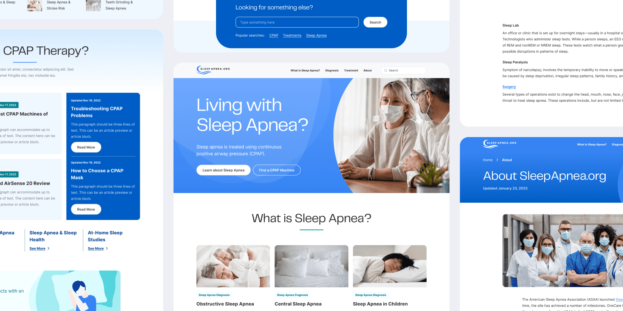
Acquired by Sleep Doctor (formerly OneCare Media) in April 2022, SleepApnea.org has provided readers with medically-backed information on a variety of sleep apnea topics. The site also offers guidance on recommended treatments, including CPAP machines, masks, and other alternatives to empower readers with knowledge to make intentional and informed decisions about their health.
As the design lead for this brand, I led and shipped redesign initiatives to adapt to the increase in content volume and evolving business strategies. I collaborated with stakeholders and our engineering team to launch the redesigned website that addressed design, content, and performance needs.
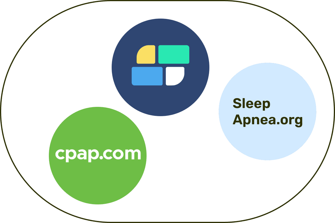
Main Sleep Doctor Brands
01
Modernize the visual identity and system
A focal point of this project was the effort to craft a meaningful and contemporary design. It had to be visually appealing but also closely align with the mission to serve as a comprehensive, approachable, and trustworthy resource for sleep apnea information and treatment avenues.
02
Integrate expanding commercial content
As SleepApnea.org's content landscape expanded, it was vital to integrate commercial content without compromising user trust or diluting the brand’s medical background. To do this, I had to consider a scalable design foundation that would reflect the growing range of SleepApnea.org’s content breadth.
03
Enhance public awareness on sleep apnea conditions
To emphasize trust and credibility, I wanted SleepApnea.org to be a go-to destination for sleep apnea education, promoting greater public understanding of the condition and its implications. This involved optimizing SEO strategies to enhance organic reach and ensure SleepApnea.org remains a touchstone for those seeking advice.
The final outcome resulted in the successful launch of the refreshed platform that has been live since July 2023. The redesign was not only cohesive in its visual narrative, but also succeeded in increasing site traffic while providing readers access to a breadth of sleep apnea information and treatment solutions.

Part 02
Research
The following is a recap of my design process.
01
Research
Initial user research and site audits were done to lay out the project scope and design goals
02
Design & Definition
The look and feel was defined after synthesizing research and addressing design feedback
03
QA & Feedback
Further design, engineering, and stakeholder conversations were held to ensure design quality
04
Post-Launch
Addressed post-design needs and V2 features after the MVP launch
By keeping in mind my high level objectives, I wanted to scope out what I wanted to achieve with this redesign. Overall, the platform faced challenges in maintaining user engagement, page retention, and site traffic, which are key metrics for online growth. In addition, the out of date design not only misaligned with user expectations but also struggled to incorporate commercial content successfully.
Through conversations with the primary stakeholder, a SEO manager, there was an emphasis of maintaining the website’s credibility, especially considering the inclusion of commercial content. The key aim was to comprehensively integrate commercial content while ensuring readers felt they were receiving unbiased, medically-supported information.
Another takeaway involved examining the competitive landscape to chart the brand’s online presence in the future. While assessing SleepApnea.org’s competitors, I considered SEO and direct revenue competitors such as SleepFoundation.com and CPAP.com. Understanding these sites led me to identify areas for differentiation, form optimization strategies, and explore potential design opportunities.
The Business Problem
I wanted to find a way to redefine and elevate SleepApnea.org as a leading medical source in the spectrum of sleep health. Specifically, there was an unreliable method in sustaining user engagement, page retention, and site traffic, which are all crucial metrics for digital visibility and growth.
The Design Problem
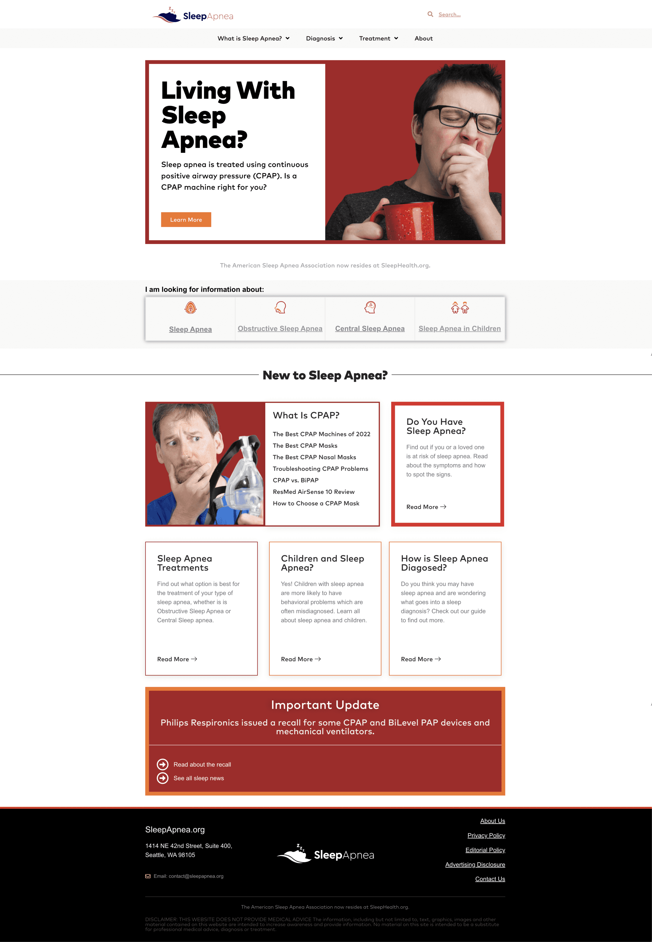
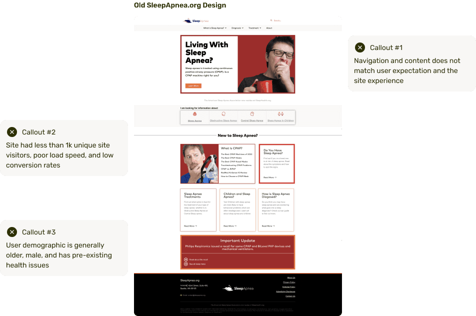
The old design presented a multitude of challenges. Mainly, the UI and experience did not align with user expectations. Moreover, there were major usability problems. For a brand that relies on reliability and credibility, these were significant roadblocks to establishing trust and growing user traffic.
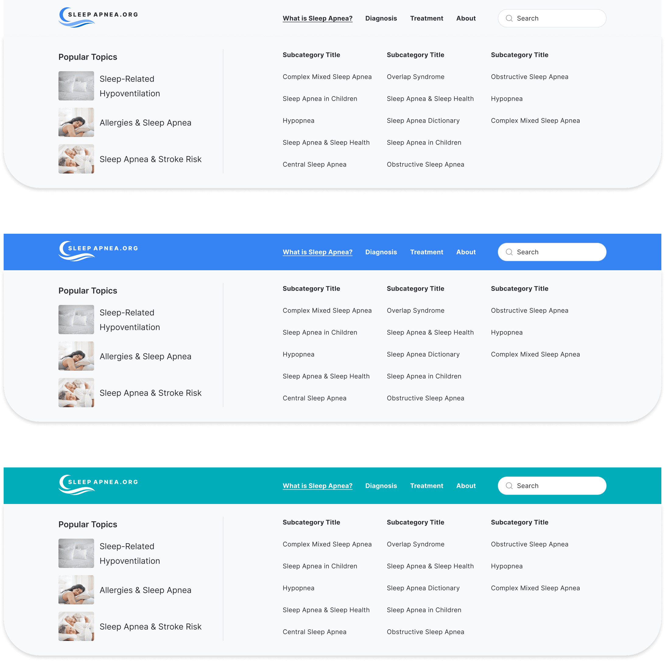
While conducting a design audit, I identified several challenges that impacted the overall quality and accessibility of the site. Notably, the navigation system was unorganized, which presented barriers and dead ends for users. Furthermore, there were noticeable inconsistencies in design elements, calling a need for standardization. Lastly, there was a lack of focus on credibility and reputation, affecting reader sentiment towards the brand. Collectively, all of these factors led to an unintuitive, unhelpful, and negative experience.
Beyond these foundational challenges, I also observed a diverse user range with varying levels of familiarity with sleep apnea. The demographic ranged from newcomers seeking education to health-conscious, curious individuals interested in a deeper understanding. Moreover, there are experienced users who are well-versed into staying up-to-date on information and treatment options. This was critical to consider in making informed design solutions later on in the process.
Part 03
Design & Definition
I conducted early stage user testing to validate and measure early successes in my proposed design direction. This also helped to probe for attitudes and sentiments participants may have about the previous design versus the proposed redesign. This qualitative approach allowed me to extract valuable insights about users’ preferences and pain points.
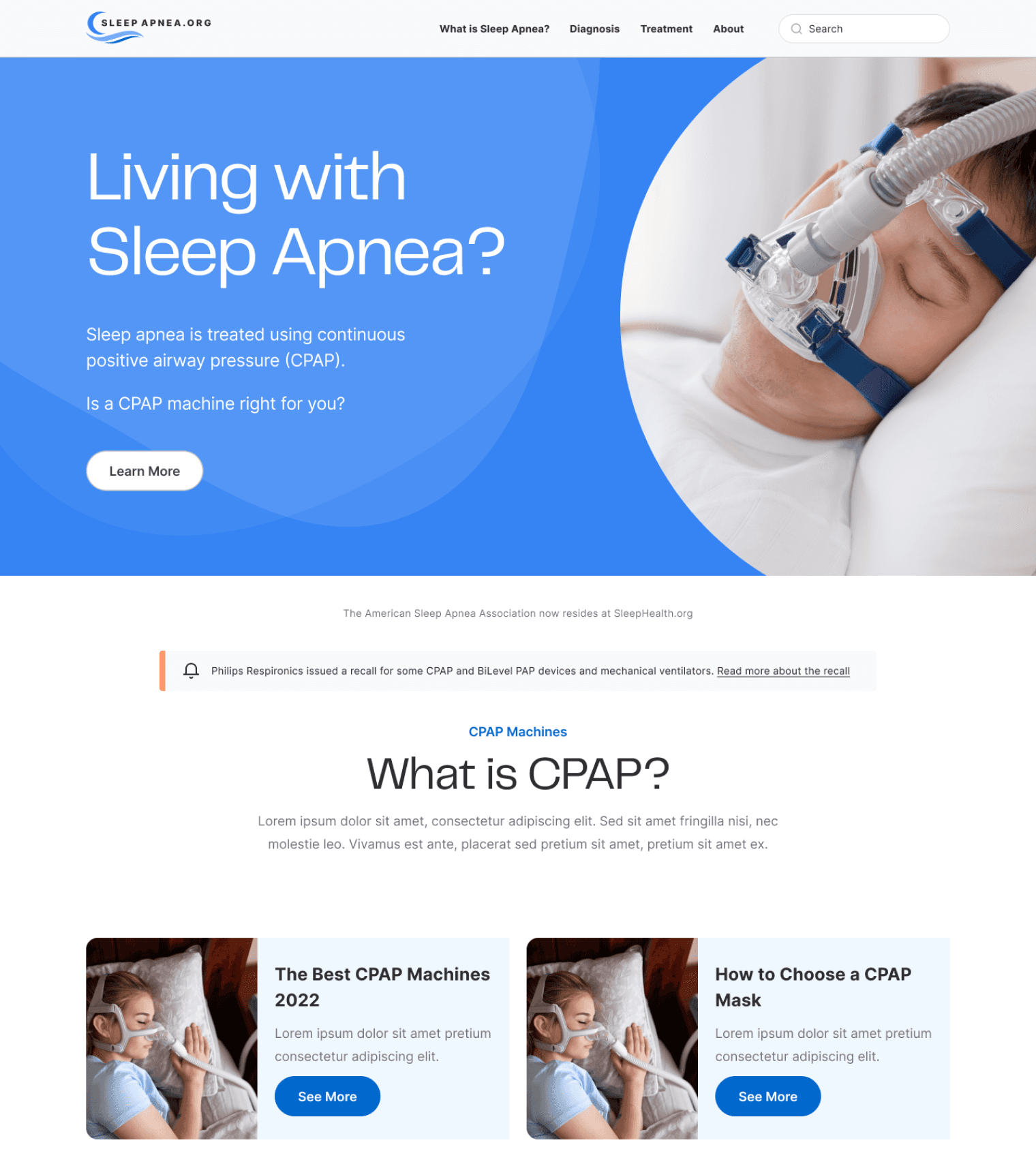
My first pass at the SleepApnea.org redesign focused on crafting the look and feel of the visual direction and establishing holistic page structure. My goal here was to identify which areas and elements most effectively captured the attention and interest of my testing participants, ensuring that key information was optimally highlighted.
Validation of Foundational Design Choices
Foundational design elements like color schemes, typography, and overall visuals were validated by participants. More than just appreciating the aesthetics, participants expressed that these choices enhanced their sense of trust in SleepApnea.org.
The Power of Optimized Imagery
One unexpected yet insightful finding was the power of imagery in shaping user perceptions. The imagery needed to avoid triggering negative first impressions and instead needed to retain users to stay on the site longer.
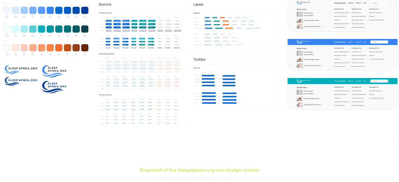
The core of the SleepApnea.org redesign is a dedication to trust, health, and professionalism. Keeping this principles in mind, I created a set of graphic visuals, UI components, and guidelines that assisted the process from design to development.
Considering the continual advancements in the health and commercial space, it was important to construct a design system agile enough for frequent updates and expansive enough for growing health and commercial content. This would ensure that the platform would stay relevant and continue to serve as a comprehensive resource over time.
Moreover, establishing the following goals for the design system helped to ensure SleepApnea.org stayed true to its role as a trusted resource while navigating its evolving content landscape.
Maintain brand integrity and user trust
It was important to ensure that the design reinforced SleepApnea.org’s brand integrity and core values. I explored various directions and settled on typographic choices, color schemes, and UI components that balanced usability, approachability, and professionalism. In essence, design decisions were driven by the goal of reinforcing SleepApnea.org’s principles while ensuring visitors to the platform left with an enhanced sense of trust and confidence.
02
Facilitate the blend of commercial and health content
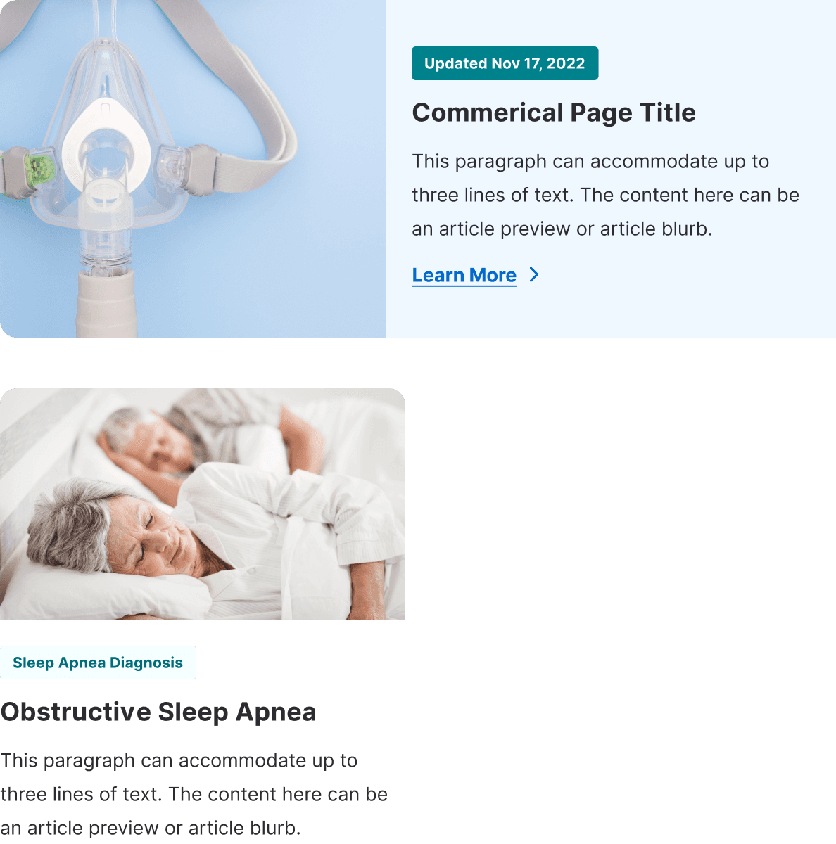
The aim was to create a solid system that effectively integrated commercial and health content throughout the site. I created a set of design components and elements that laid out commercial content to display product information without detracting from the site’s main informational purpose.
03
Support cross-functional collaboration and productivity
Effectively documenting guidelines helped to reduce ambiguities and minimize back-and-forth between design and engineering. By laying out component specifications, interactions, and usage guidelines, my design system became a collaborative tool. This clarity helped to align understanding of the design’s vision and execution for team members.
Initial Home Iteration
Early Design Exploration

200
participants
collected
78%
prefer the redesign over the old design
84%
said the redesign is trustworthy
Medical trust
“It [redesign] looks less clinical and more approachable...I think the blue color goes better with medical related field”
Reaction to imagery
“...hero image might be sensitive for some people...living with sleep apnea could possibly trigger a negative mood in a person”
Professionalism and credibility
“...more professional and the image showed a clear use of the product...I would view this website as an easy-to-navigate, helpful resource”
Part 04
QA & Feedback
Through conversations with the design team and engineering team, I encountered several concerns related to readability, hierarchy, and overall performance. This challenge resulted in having to balance design aesthetics and ensure optimal technical performance.
During my iterative process, I evaluated visual accessibility of color contrasts in design elements and the performance implications of my typography selections and its consequential CLS issues. Moreover, one of the more nuanced challenges I encountered was the inconsistency in how design hierarchies were interpreted across engineering and content channels. For example, the naming conventions I used for structural elements like color values and heading hierarchy differed, causing initial confusion.
As a result of these clarifications and feedback conversations, I made adjustments to color values for consistency, optimizing spacing and sizing for readability, improving content layouts for better flow, and selecting alternative typography for fallback scenarios.
Before
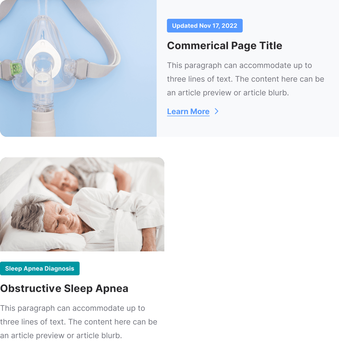
Following feedback iteration, I revisited my design choices to meet WCAG standards particularly keeping in mind the potential diverse user groups visiting SleepApnea.org.
Ensuring inclusivity and accessibility, design components underwent thorough accessibility evaluations based on design and engineering team feedback. I modified color contrasts to ensure sufficient visibility, adjusted text sizes for better readability, and refined interactive elements to be intuitive. The end goal was to provide users with a positive and seamless browsing experience.

Part 04
Outcome
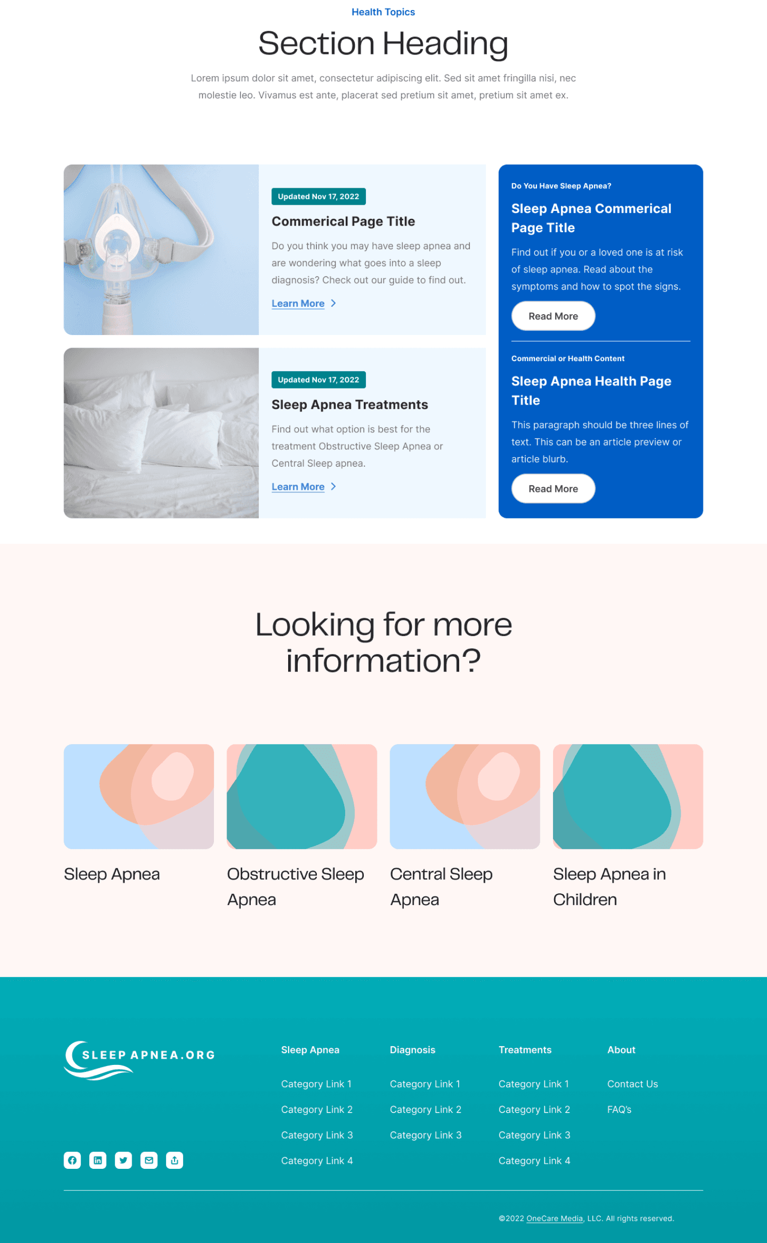
The comprehensive redesign of SleepApnea.org resulted in a series of five foundational and responsive page templates, crafted to seamlessly cater to both non-commercial and commercial content needs.
Home
As the first touchpoint for new users, especially those arriving via sources such as Google search, the goal was to highlight sleep apnea topics and the latest insights. I aimed for it to be both informative and subtly commercial, offering a transition into the depth of content available.
Commercial and Review
The structure of the commercial article pages was intended to drive user engagement around sleep apnea-centric products and solutions. However, I took care to present commercial content in a manner that felt genuine and helpful, not overly promotional.
Health
The primary aim of the health pages was designed to be predominantly informative. Here, the emphasis was on calling out insights from medical experts, ensuring that the content resonated with authenticity and trustworthiness, thereby fostering confidence among users to make informed decisions.
About
The goal of crafting a well thought-out About page was to showcase the dedicated experts and writers behind SleepApnea.org’s content. This was to support the notions of credibility and commitment behind the platform.
SleepApnea.org Main Pages
Before Redesign
After Redesign
As the main website redesign was launched following the design handoff to the engineering team, a business decision was made to create a product page offering an at-home sleep apnea test, specifically tailored for readers interested in self-diagnosing their condition. After the design handoff to engineering, I made a simple e-commerce site addressing this business need.
Part 04
Conclusion & Metrics
In sum, the following key improvements were accomplished.
01
Solidifying SleepApnea.org as a pillar for sleep apnea information
In the vast landscape of digital health information, it's critical to intentionally position a niche topic. The redesign of SleepApnea.org was a strategic move for the company to anchor the platform as a trustworthy resource in the digital health space. By highlighting key points through visual emphasis, featuring expert insights, and crafting thought-out reading experiences, I aimed to ensure users would view SleepApnea.org as a go-to health resource.
02
Modernizing the design to adapt to evolving content
Recognizing the dynamic nature of online content, I designed a modular and flexible design system that serves as a foundation to evolving changes. By doing so, I aimed for SleepApnea.org to effectively accommodate future pivots in format, volume, or topics to ensure a consistent experience throughout. Furthermore, I created a visual design that was refreshed and reflected a sense of professionalism.
03
Setting the stage for SEO and long-term growth
I laid the groundwork for SleepApnea.org to thrive and grow organically over time. Implementing content and UX strategies, I aimed to optimize site performance, encourage discoverability, and ensure that the content reaches users who are actively searching for the information they are looking for. Post-launch, the platform witnessed a noteworthy surge in user engagement, with longer session durations and traffic.
01
Crafting a robust design system from scratch
This was a first for me into crafting a comprehensive design system from the ground up. I learned the importance of establishing a foundational roadmap that could adapt and scale as the platform grows in the future. Beyond aesthetic guidelines, I learned how to construct a framework capable of evolving with expanding content and user needs. Moreover, building a design system acted as a shared language between design and engineering processes to enable efficient collaboration and productivity.
02
Designing to educate users about sleep apnea
As a designer, my guiding principle was to always keep in mind user-centric design for the various users that visited SleepApnea.org. Given the wide range of audience demographics, it was essential to balance detailed medical information and ensure digestibility to create a thoughtful and helpful browsing experience. In essence, my design choices were geared towards empowering users to make educated and informed decision-making without feeling overwhelmed or intimidated.
03
Balancing aesthetics and technical trade-offs
There was a delicate line between the ideal design vision and the practical constraints of performance impacts. Throughout my process, I considered whether my design decisions were feasible enough without compromising site performance or complicating development, which ultimately led to the informed design outcome. Through insightful conversations with the engineering team, I learned that a compromise was valuable in maintaining usability and aesthetic appeal without overburdening the development process.
Thanks for reading!

