Part 01
Overview
The Sleep Doctor is a medically-backed sleep health platform offering comprehensive educational resources, expert recommendations, and relevant solutions. The brand was initially established by Dr. Michael Breus and predominantly gained significant media traction.
After being acquired by Sleep Doctor (formerly OneCare Media) in early 2022, the platform’s focus shifted to deliver holistic sleep health content, up-to-date industry knowledge, and various expert opinions, strategically aiming to reach a broader demographic and securing itself as a pillar in the digital health space.
During my time, I took ownership of the post-launch timeline for the main Sleep Doctor site experience. As the brand evolved, a business opportunity arose to expand into a direct-to-consumer (D2C) model through the addition of an e-commerce site offering a range of treatment products, supplements, and sleep solutions.
01
Stage One
I led the design efforts for the post-launch agenda of the main Sleep Doctor site; the initial V1 redesign was completed by another designer. My responsibilities included addressing edge cases, streamlining UX gaps, and enhancing the brand integrity.
02
Stage Two
With the e-commerce expansion, my focus shifted to customer growth, monetization strategies, and site architecture. This phase required more cross-disciplinary collaboration with stakeholders, product managers, and engineers.
Stage One: Main Site
Stage Two: E-Commerce Site
01
Drive engagement metrics to grow brand presence
The main objective was to refine the end-to-end reader experience on the main site to ultimately drive customer conversion. Additionally, increasing user metrics in performance and site duration was crucial to expanding brand presence.
02
Facilitate revenue growth through customer conversion
Focusing on monetization strategies and affiliate marketing was essential to drive customer interest. Showcasing word-of-mouth testimonials was key to solidify credibility and support revenue growth.
03
Enhance accessibility and clarity of medical information
Simplifying complex medical information for the general audience was another focal point. The aim is to distill content into digestible chunks, incorporating engaging visuals, and creating easy to follow elements.
The project resulted in the successful launch of the V2 designs and the subsequent e-commerce site in Fall 2023. This accomplishment not only met my design goal of refining the Sleep Doctor brand but also scaled the initial site into a comprehensive informational and commercial destination for sleep health, effectively serving both readers and customers alike.
Part 02
The Main Site
I took ownership of the V2 experience and addressed post-launch design requests from stakeholders, specifically from SEO managers and the company leadership. This involved refining and enhancing the user experience, which ultimately led to the growth and addition of the Sleep Doctor e-commerce site. The following is a recap of my design process throughout this project.
One of my initial responsibilities was to improve user engagement metrics on the newly redesigned Sleep Doctor website. I collaborated with the user testing team to conduct A/B tests on core monetization items such as product cards, the page hero, product pick lists, and CTA banners. We tested copywriting, content layout, product imagery, and information density to identify the most effective iteration for engagement and retention.
After testing a key monetization module, the sleep product cards, the results showed a statistically significant preference for Option B. The feedback and insights guided my final design refinements, resulting in a more effective monetization strategy and increased click rates to drive users to the product page.
MAAP Testing on Product Cards
Option A (Independent Variable)
Option B (Selected Iteration)
Option C
Leveraging feedback from user testing and stakeholder insight from the primary SEO manager of the brand, I was able to better refine the V2 experience of the Sleep Doctor website and address any usability gaps.
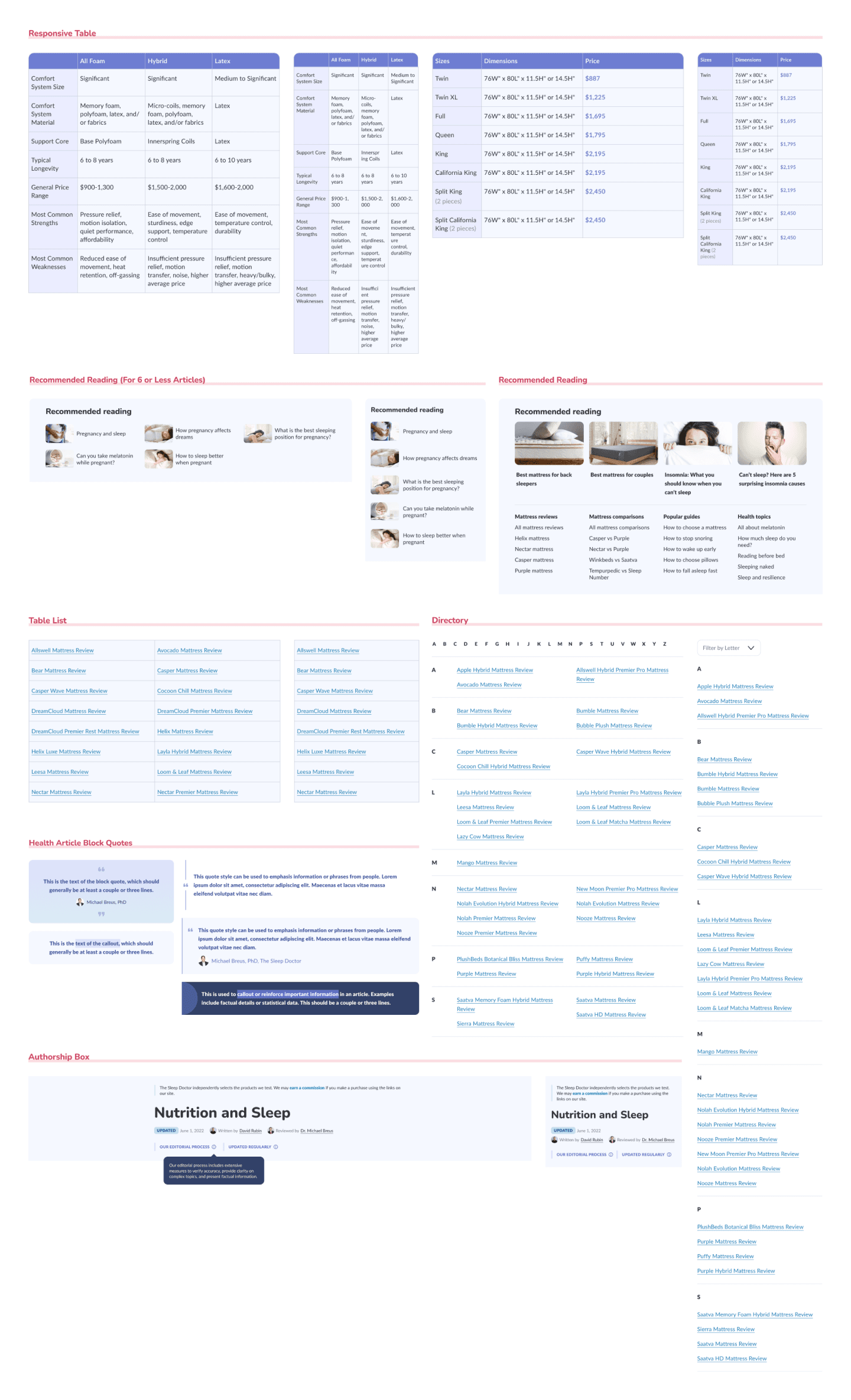
I created responsive tables for comparing sleep products, added elements to emphasize medical credibility, defined site interactions, and furthered the home and article pages with design modules that were not included in the MVP launch. These improvements ensured an optimal and scalable reading experience as the content expanded.
A major V2 update to the TSD website included a typeface overhaul, brought up by the engineering team. Due to load performance issues, Proxima Nova Condensed, the primary typeface, was replaced with Nunito for headings and Lato for body text, both sourced from Google Fonts. While the new typefaces slightly increased the vertical page length, they significantly improved site readability and better reflected the brand identity.
By integrating cross-functional feedback and requests, I aligned user needs, performance requirements, and business goals, ensuring the site's evolution matched the broader long-term vision. Additionally, the enhancements went beyond aesthetic improvements, delivering user value and a more effective navigating experience.
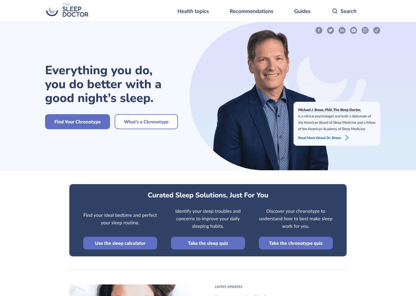
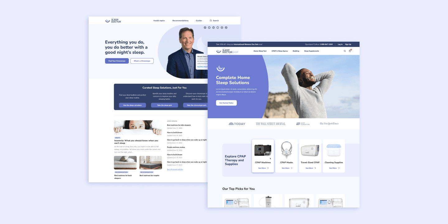
V1 Landing Hero
V2 Landing Hero
The Project Goals
Incorporate Stakeholder Feedback
Designed new modules that addressed specific requests and included designs that were not part of the initial MVP. These improvements ensured that the site aligned with both user needs and business goals.
Highlight TSD Brand & Personality
Emphasized trust and credibility by featuring Dr. Breus and strategically using more color and typography throughout the site. The aim was to create a more engaging and appealing experience.
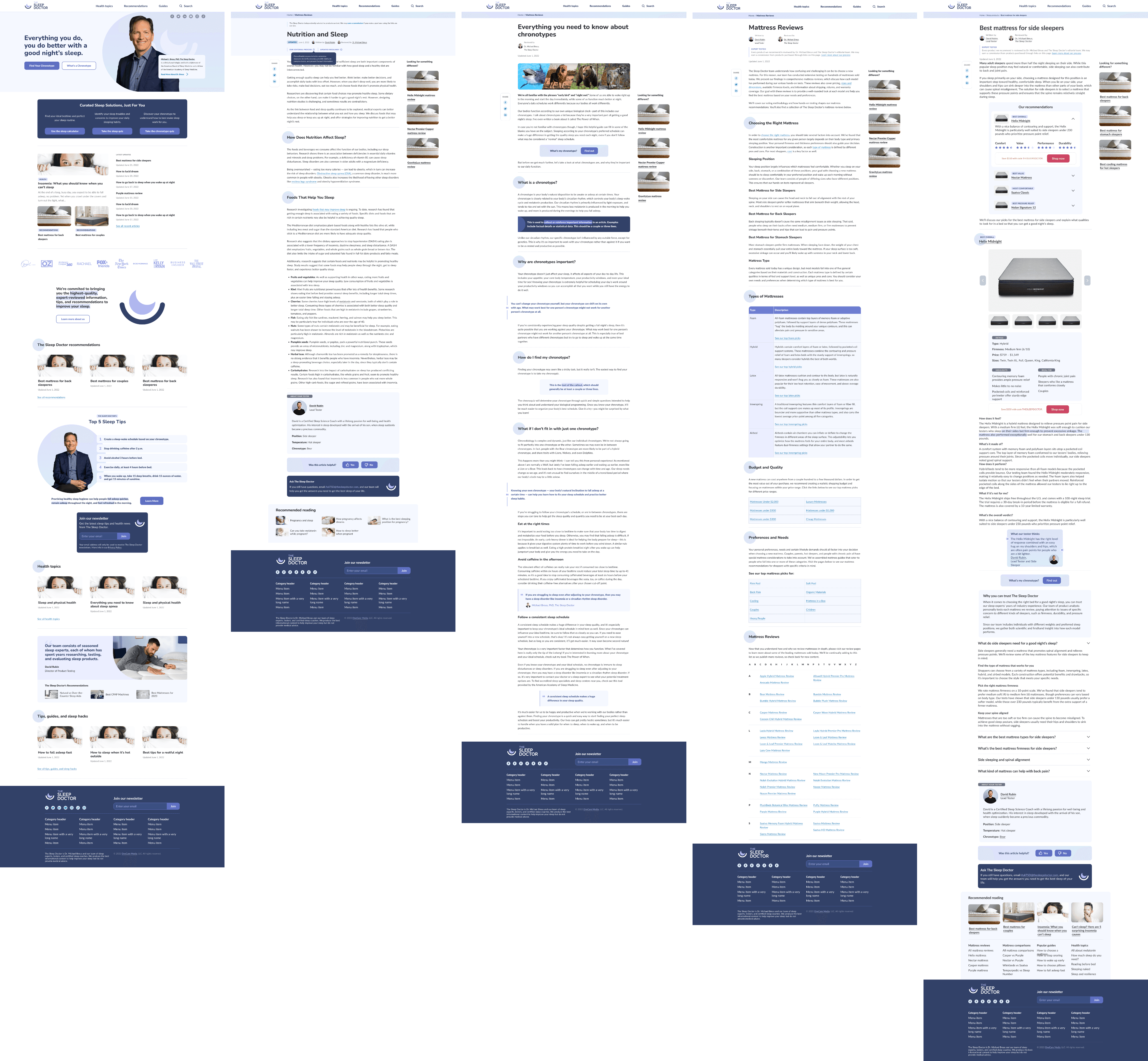
V2 The Sleep Doctor Core Pages
Part 03
The Shop Site
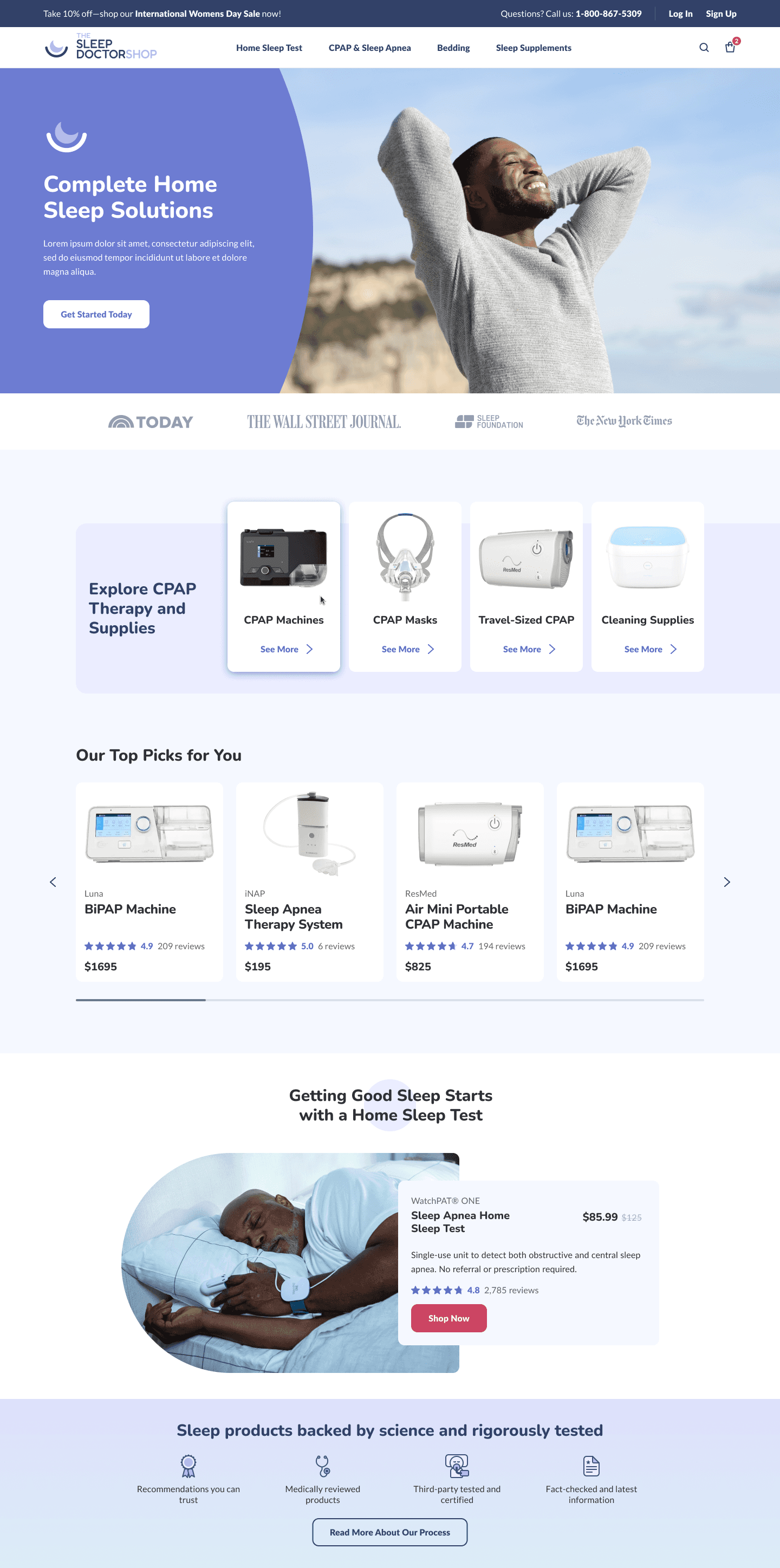
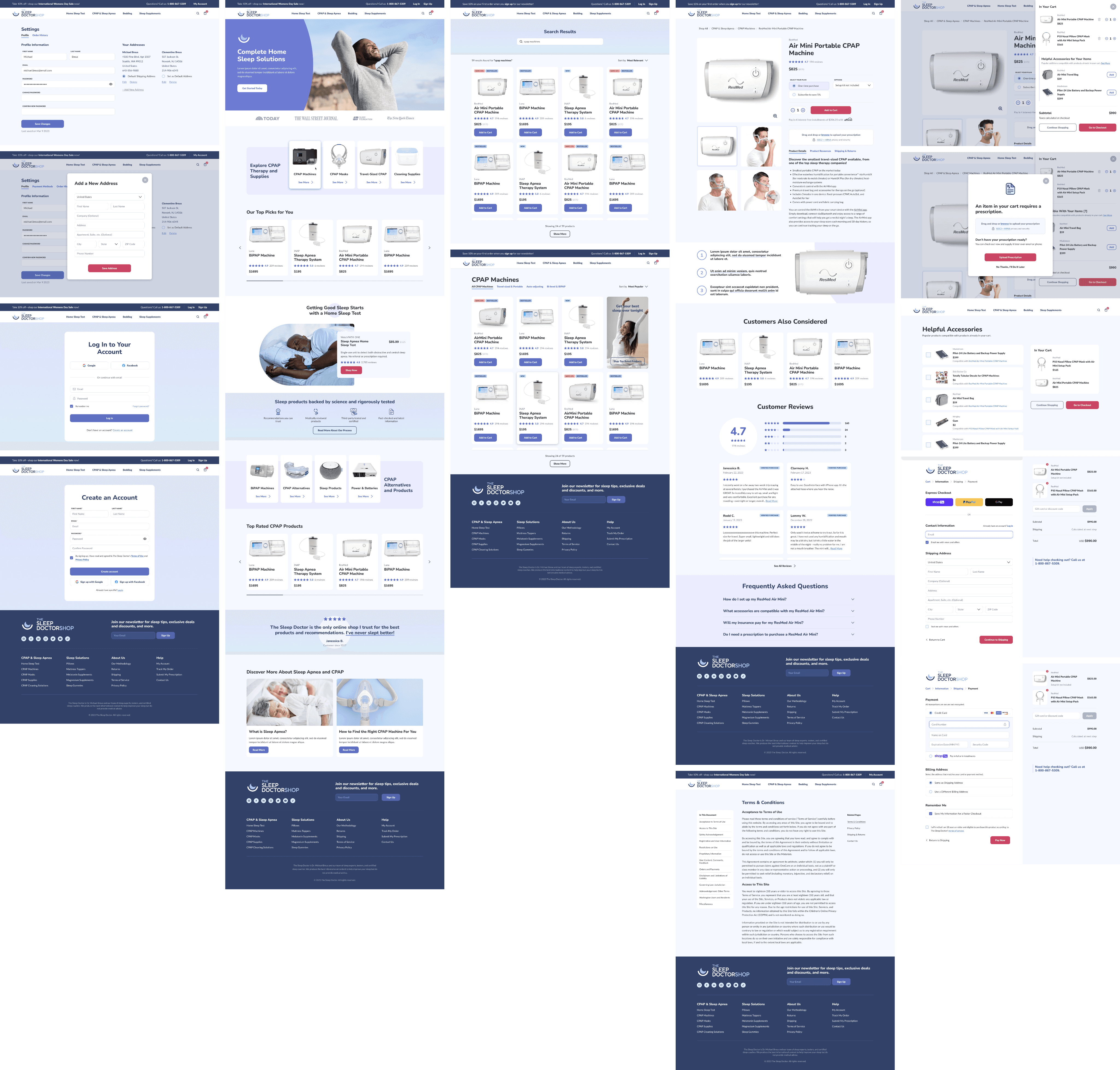
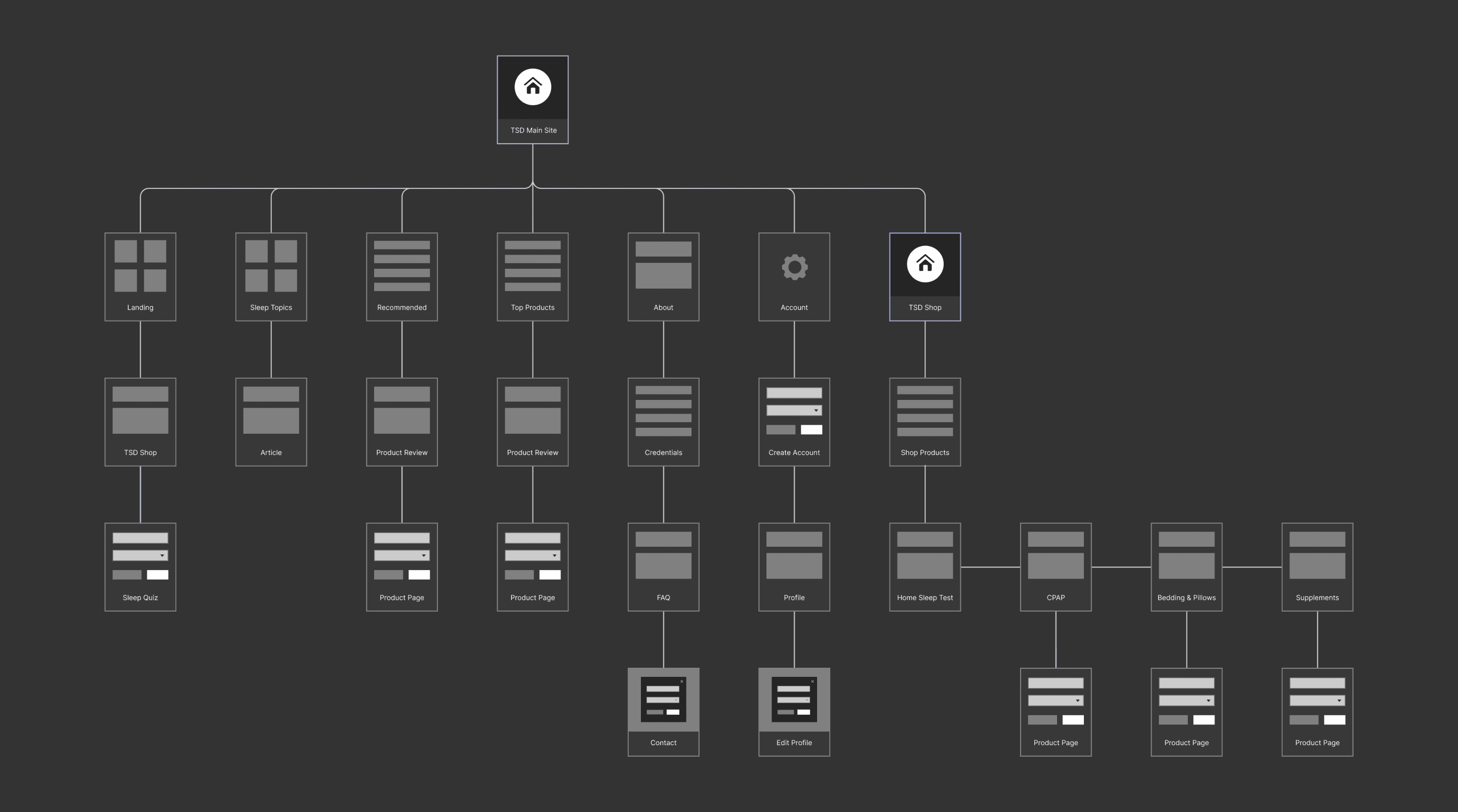
As the Sleep Doctor site gained traction, a strategic business decision was made to expand the brand by transitioning to a direct-to-consumer (D2C) model with a new e-commerce platform. As the lead designer, I facilitated the transition by driving paid traffic and user growth from the main site to the new e-commerce site, while also designing the overall Sleep Doctor shop experience.
01
Design a holistic e-commerce experience from discovery to purchase
The goal is to create an effortless and satisfying shopping experience, guiding potential customers seamlessly through the entire journey from discovery to purchase. This involves ensuring an intuitive and consistent user journey across various touch points, maintaining trust and satisfaction throughout.
02
Grow conversion metrics from readers to customers
A long-term objective is to increase the conversion rate of readers to paying customers through strategic design and user engagement strategies. This includes using compelling CTAs, integrating engaging and informative content, and incorporating trust signals such as customer reviews and secure payment icons to build credibility and encourage purchases.
03
Maintain brand consistency between the main and shop sites
It is essential to align the design language of the Sleep Doctor main site with that of the e-commerce site to reflect the brand identity. Maintaining a cohesive and visually appealing design, utilizing high-quality images, and ensuring consistency across both platforms are crucial for building brand loyalty and trust.
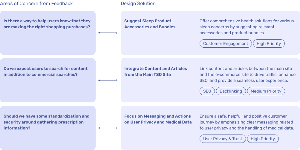
After creating the core pages of the TSD shop experience and presenting the initial pass of the e-commerce design to stakeholders and the engineering team, the feedback received highlighted several key areas for improvement.
One critical insight was the need to help users feel confident in their shopping decisions, such as suggesting a sleep apnea test before purchasing a CPAP machine. Additionally, it was noted that users might want to search for informative content in addition to commercial products, especially if they enter directly from the e-commerce site. As such, I prioritized the most critical design areas and planned additional features for a later V2 shop experience. Lastly, I rethought certain UX functions, such as implementing drag-and-drop features, to enhance overall user interaction and site functionality.
The Sleep Doctor E-Commerce Site Experience
Part 04
Conclusion
01
Going beyond content design and scaling for e-commerce
Expanding from content design to e-commerce required creating strategic navigation and ensuring a positive customer journey from discovery to checkout. Most importantly, scaling for e-commerce involved creating a consistent brand experience from the main site to support both new and returning users.
02
Navigating stakeholder feedback to target design and business goals
My design process involved handling frequent stakeholder feedback which meant balancing diverse opinions and aligning them with my design goals. This required clear communication, prioritization of critical features, and incorporating feedback into actionable design solutions.
03
Balancing multiple delivery timelines for projects at the same time
While working on TSD, I was leading other projects with overlapping timelines. This required setting clear expectations, defining project milestones, and ensuring each project had adequate resources and attention. Regularly communicating with my design manager and the stakeholders involved helped to address any issues promptly and keep my priorities on track.
01
Delivered the V2 Sleep Doctor site and e-commerce experience
I successfully delivered the V2 Sleep Doctor site and facilitated the handoff and launch of the e-commerce platform. The new V2 design addressed usability gaps, improved accessibility, and increased overall user engagement, resulting in a connected browsing and educational experience. The new e-commerce site not only boosted sales revenue but also pivoted the brand into a direct-to-consumer (D2C) model, providing comprehensive health solutions directly to users.
02
Elevated the brand to deliver to millions of users
The goal was to convert readers on the Sleep Doctor site into customers on the e-commerce platform. I elevated the brand identity, improved the user experience, and emphasized medical credibility across all touch points. This resulted in increased conversion rates and improved user engagement while attracting a broader audience, significantly increasing traffic metrics by over 120% since launch. The brand now attracts over 5.7 million unique visitors per month.
03
Positioned the Sleep Doctor for long-term growth
I went beyond the initial project scope by taking on additional responsibilities to secure a long-term vision for the brand. This involved conceptualizing a “Sleep as a Service” (SaaS) experience, creating a V2 e-commerce roadmap, and iterating on personalized sleep tool features that were not developed due to investment limitations. By future-proofing the platform, I aimed to position the Sleep Doctor effectively in the digital sleep health space in the long term.
Thanks for reading!


