Part 01
Project Brief
Tools and Equipment at the Sam Fox School
Students at the Sam Fox School regularly utilize the studio shop spaces to access equipment and tools throughout the school semester. Due to the additional impact of COVID-19 on studio protocols, the school has adapted several changes to the studio shop reservation process.
The focus of this mobile app is to address the unsatisfactory experience that students in the Sam Fox School currently experience when trying to book a reservation for a studio shop. I aimed to design a solution that is flexible and adaptive by establishing a friendly language while making the reservation process efficient and accessible for busy students with occupied schedules.
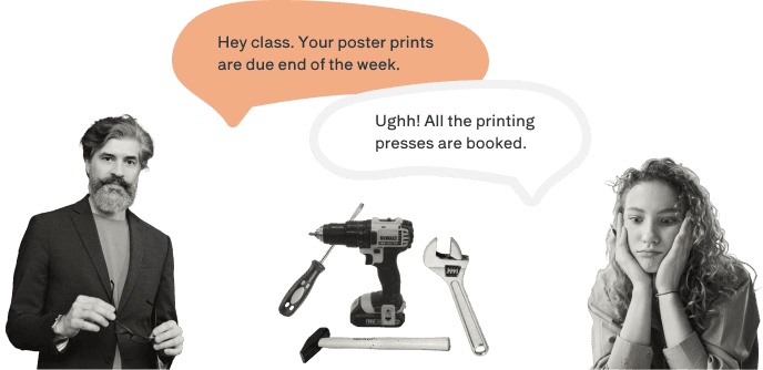
Through a series of interviews with shop technicians, students, and faculty, many people felt stressed about conflicting or ambiguous times and the lack of clear communication. Given the diverse range of equipment and creative processes within the Sam Fox School environment, there are multiple experiences and accommodations that need to be considered.
Throughout my process, it was important to create a secure and reliable system that fit the needs of students and their schedules.
How should the existing reservation system integrate with new contexts to make the process of accessing equipment and tools more seamless?
Defining the Problem Space
It’s challenging to coordinate real-time updates of events and changing activity in shop spaces within the Sam Fox School. Overall, there is a lack of a centralized system and there are barriers to how students may feel about approaching and engaging in new spaces, particularly workshops and studios where they need to use the equipment but may not feel as confident to do so. There are also a variety of users that make up the SFS community; SFS students, non-SFS students, shop monitors, shop technicians, faculty, and administrators.
How can the existing process of accessing tools and equipment in the Sam Fox School be more transparent and seamless, particularly with COVID-19 protocols?
The Existing Process and Pain Points
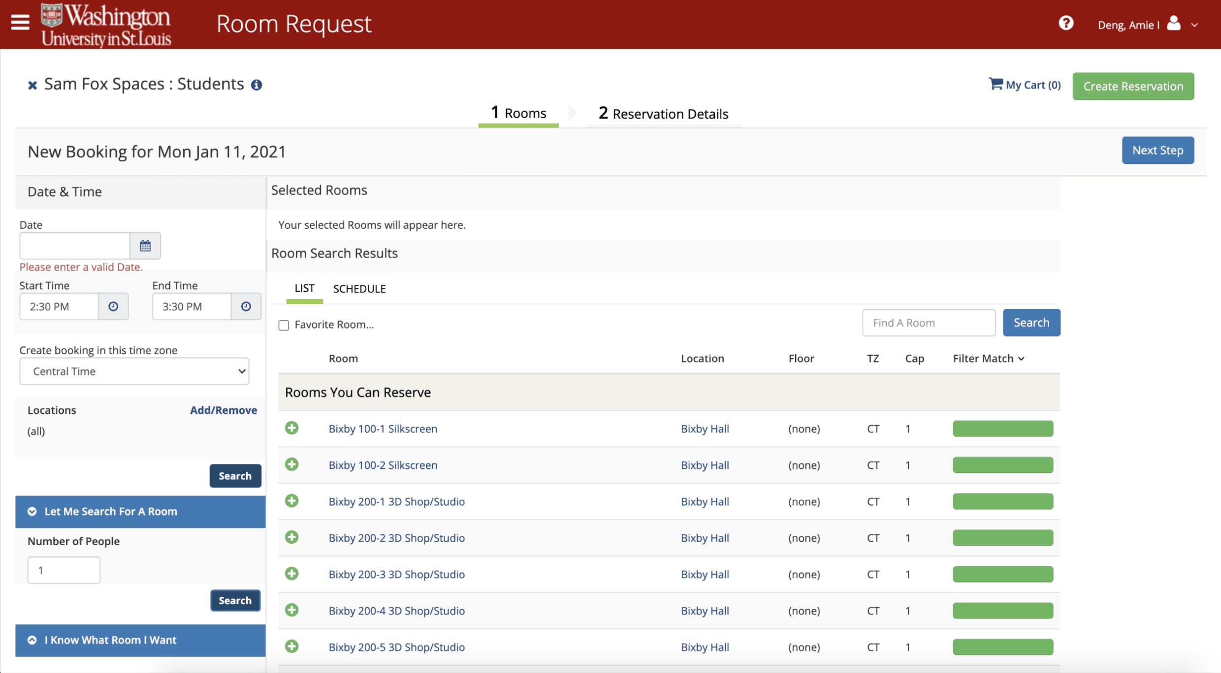
Currently, studio spaces are reserved either through walk-in times or studio-specific reservations organized by shop technicians. Unfortunately, many students are not aware that an online reservation system exists and there is also no existing mobile app for creating reservations.
Moreover, the existing reservation process is overwhelming, confusing, and challenging to navigate. As a result, users often struggle to understand how to make a proper reservation.
At first glance, users are prompted to input a date and time and then select the desired room for reservation. However, wouldn't it be more helpful for students to know which studio spaces are available and which times are available before making their selection?
The web reservation system fails to provide significant advantages over in-person walk-ins. Although the current reservation process consists of two steps, the lack of informative guidance leads to a weak visualization of the reservation being made.
Current Reservation Experience
The Informed Solution
The SFS Shop Reservation app is designed for the needs of busy college students by providing an accessible experience when equipment booking. Its goal is to establish a systematic yet visualized approach to browsing and managing reservations for students and shop technicians.
By creating a low-error and smooth scheduling flow, students can seamlessly create reservations and build the confidence to explore what the Sam Fox School community has to offer.
Filter by Spaces or Material to Individualize Browsing
Students can opt for a quick-browsing experience by filtering directly to the spaces or materials they are working with. The flexibility to filter empowers students to navigate selections more effectively and saves them valuable time.
View Available Times When Reserving Spaces
The visualization of time lets students identify the information they need and make informed decisions. This approach not only eliminates guesswork but also lets students prioritize and select suitable time slots for their needs.
Communicate With Shop Monitors Asynchronously
Sending preset messages through the chat feature allows for standardized notification and communication regarding safety and proper equipment procedures. This offers students the convenience of receiving information in a private setting.
Part 02
Discover
User Interviews: Starting Wide
At this stage, it was important to take the time to learn from others and consider the various perspectives of direct users, indirect users, and people within the organization. To do this, our class participated in a series of user interviews with various individuals to gain a deeper understanding of the problems at hand.
As a class, we were split into groups to interview various shop space users and shop technicians. Throughout each interview, we took notes of observations or phrases that felt actionable, surprising, and important.
Example Questions Asked to Shop Space Users (Front-End Users)
Could you tell us how your experience has been using the shops?
Can you walk us through how you reserve a shop tool or space?
How often do you use shop technicians as a resource? What type of information is helpful in facilitating collaboration?
Example Questions Asked to Shop Technicians (Back-End Users)
Can you walk us through what a typical workday look like?
What other kinds of challenges do you face?
How have COVID-19 protocols affected the way you oversee shop spaces?
What is the difference between how you oversee your shop space versus how other shop technicians oversee their shop space?
Breaking Down the Users: Narrowing Down
As a class, we conducted interviews with nine shop technicians responsible for managing the SFS studios and different equipment. This allowed us to gain valuable insights into the existing considerations, pain points, and experiences. We then synthesized the data into affinity diagrams to visualize the main categories at hand. One key observation I noted was that studio shop procedures vary based on the specific equipment and the individual shop technician in charge. How could I design a familiar system that ensures accessibility and ease in navigation when limited verbal communication and unpredictable schedule changes occur?
Overall, it became evident that there needed to be an improvement to the system made for viewing, creating, and editing schedules and times while also maintaining proper communication especially with COVID-19 protocols in place.
How could I design a familiar system that ensures accessibility and ease in navigation when limited verbal communication and unpredictable schedule changes occur?
Key Observations and Insights
01
Communication is critical to flexibility
The studio shops at the SFS operate independently of one another, each with its own distinctive training and equipment, and there is minimal collaboration and coordination among shop technicians. Moreover, within physical studio spaces with noisy machinery, verbal communication becomes challenging due to the high levels of noise and the mandatory use of safety equipment.
02
Hybrid learning structure increases online technology use
Traditionally, studio shop technicians would provide in-person demonstrations of equipment directions and protocols. However, with the shift to hybrid class structures and lower physical attendance, training for equipment and tools has transitioned to digital formats. Now, shop technicians use methods such as presentation slides and videos to interact with students during classes.
03
Hesitation and intimidation lead to barriers
Within the SFS, some shop spaces may come across as intimidating or less approachable compared to others, which can cause students to feel hesitant when approaching new equipment or unfamiliar spaces. Particularly for students who need to work across multiple spaces to access various tools, it becomes crucial for shop spaces to foster a sense of welcoming and inclusivity.
The Overarching Challenge
How might I design a visualized reservation system that allows for information visibility and consistent communication across multiple studio spaces? From what was gathered during research and user interviews, each studio shop had their own set of internal training and safety protocols, schedules, and maintenance. As a result, this can lead to inconsistent communication and coordination, especially among students trying to use studio equipment and spaces.
How might I design a visualized reservation system that allows for information visibility and consistent communication across multiple studio spaces?
Personas and Critical User Journeys
By exploring various approaches to identify potential solutions, I consolidated our research findings and decided to prioritize improving flexibility and fostering a sense of community. One of the key frustrations that users, including myself, encountered while using the current online reservation system was the lack of transparency regarding time and equipment availability.
Drawing from the insights obtained through the user research, it became clear that establishing a reliable and seamless experience was crucial. With this in mind, I challenged myself to envision a multi-channel system that would benefit the students, shop monitors, and shop technicians alike to enhance visibility and user satisfaction.
Building on the observations and findings, I created three critical user journeys to gain a deeper empathetic understanding of the different perspectives at hand.
Part 03
Design & Prototype
Defining the Design Goals
01
Provide a flexible and efficient system
To accommodate the unpredictable schedule changes frequently experienced by busy college students, it was crucial to design a flexible and efficient system that enables seamless coordination between students and shop technicians.
02
Reduce negative emotions and barriers
A large problem identified through observations and findings was the reluctance, shyness, or fear experienced by students when it came to exploring new equipment or seeking assistance. Additionally, the existing community-building structure within the SFS can appear rigid, providing little opportunity for students to learn from each other and establish comfortable connections.
03
Encourage discoverability and exploration
Based on the user interviews, people expressed need for a more accessible view of shop spaces, equipment, and materials to encourage both exploration and discoverability among new and familiar students. Simultaneously, on the back-end, shop technicians would be able to access a concise and pertinent overview of schedules and reservations.
Ideating Design Solutions
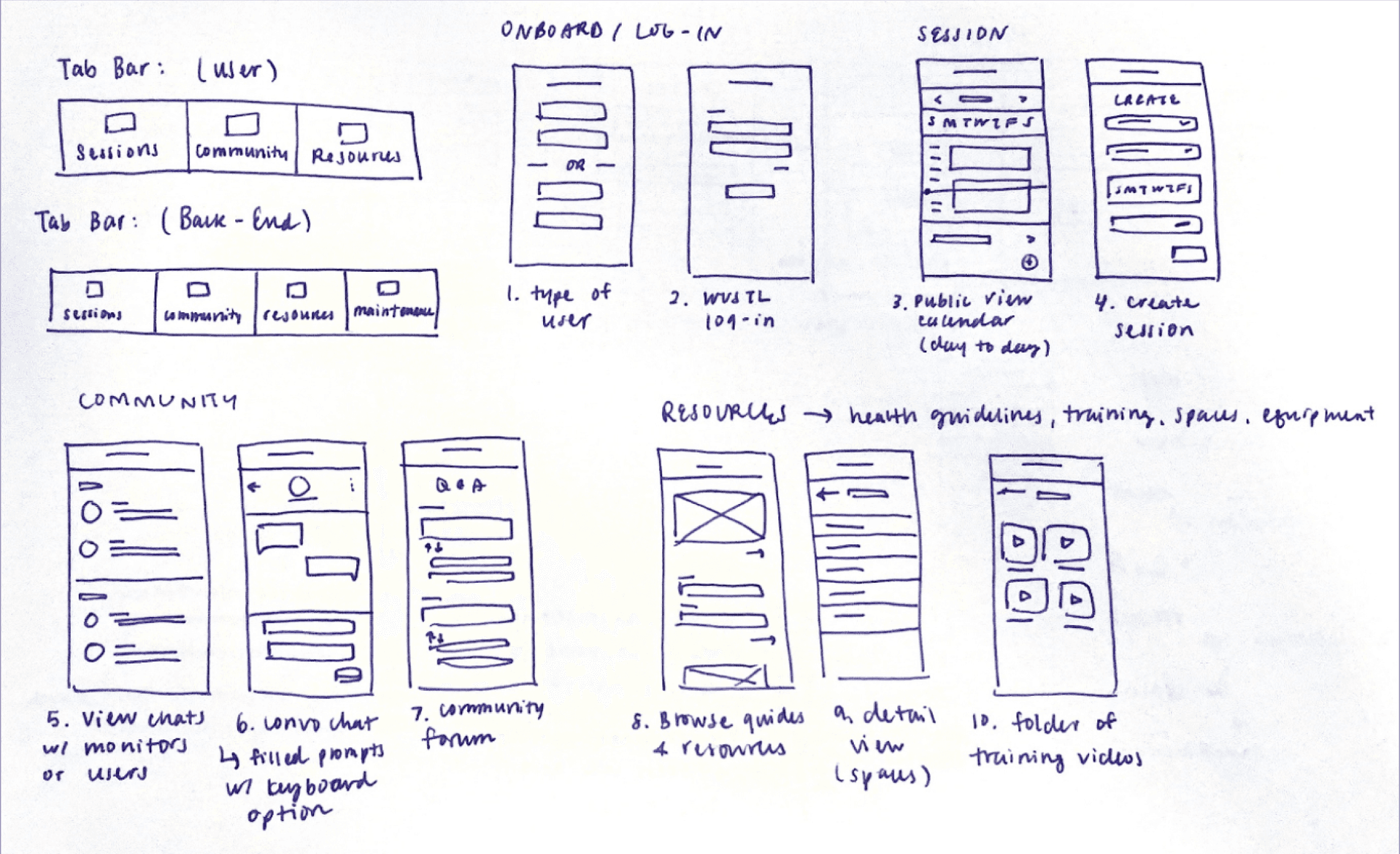
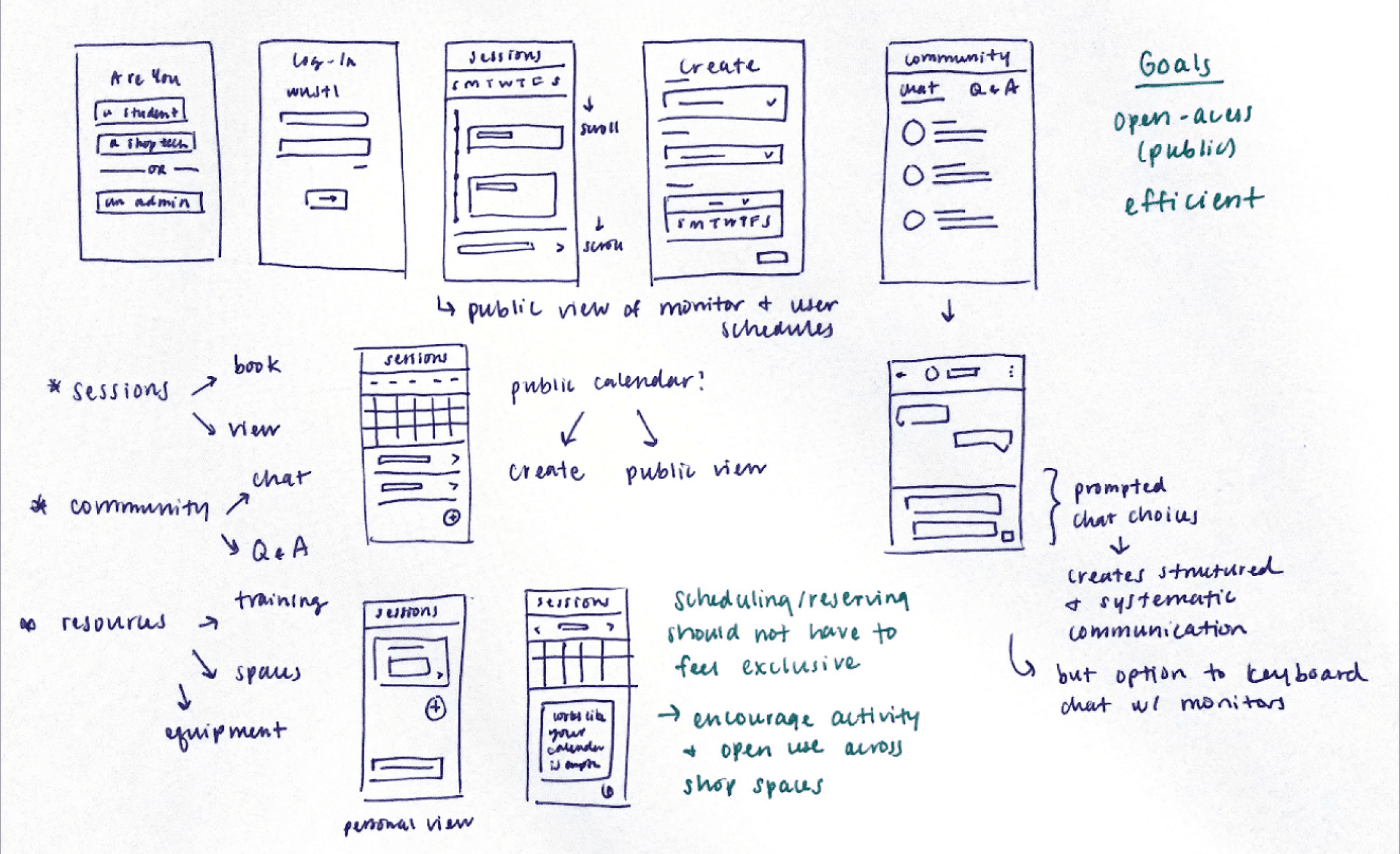
I started with pen and paper to generate low-fidelity designs of potential directions that would target solutions toward flexibility and communication.
At this stage, I received design feedback from peers and users. Some considerations included the edge cases of impromptu durations, verification checks, and chat usage. What if users have finished using their equipment early or needed more time? What are the verification requirements needed to use various studio equipment? What does the chat feature do exactly for users?
Low-Fidelity Brainstorming
Diving into Wireframes and UI Explorations
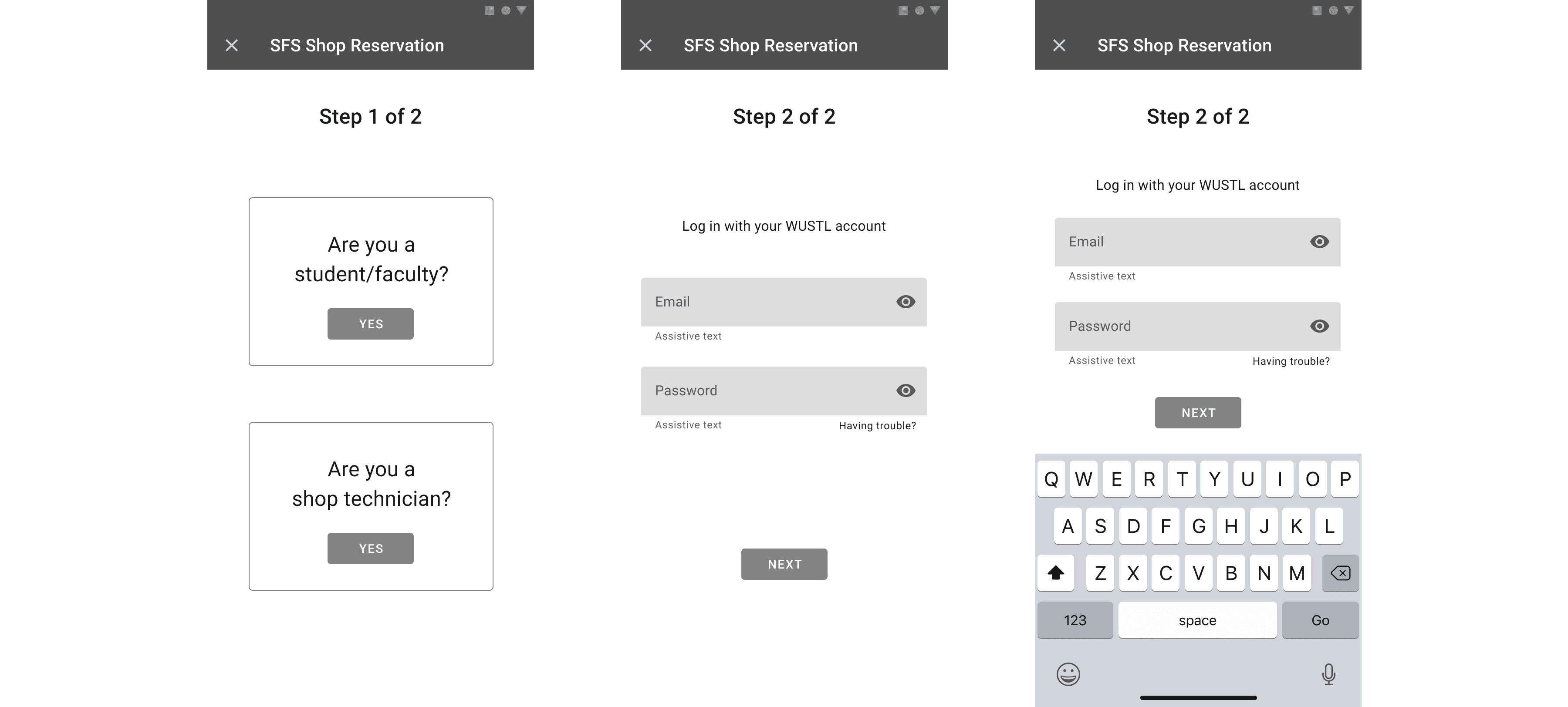
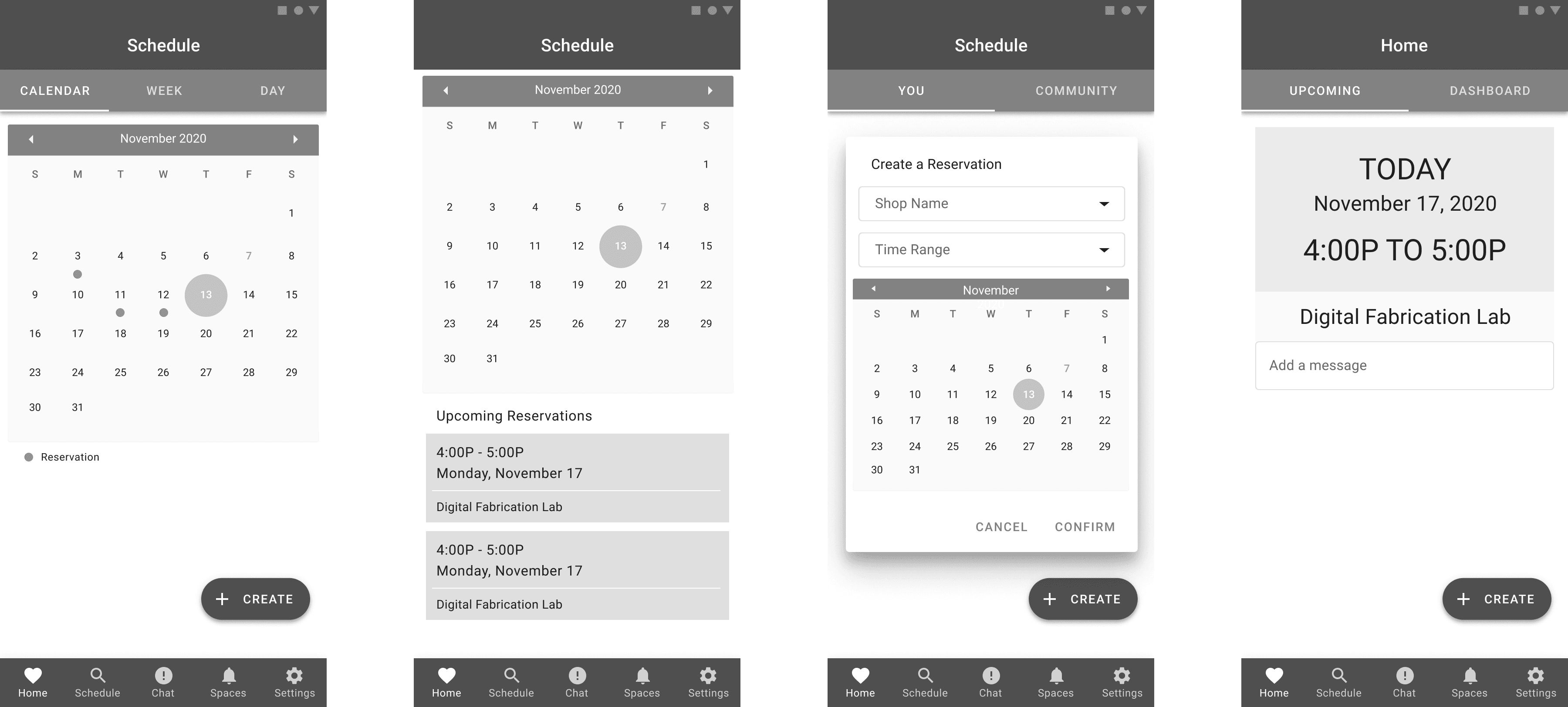
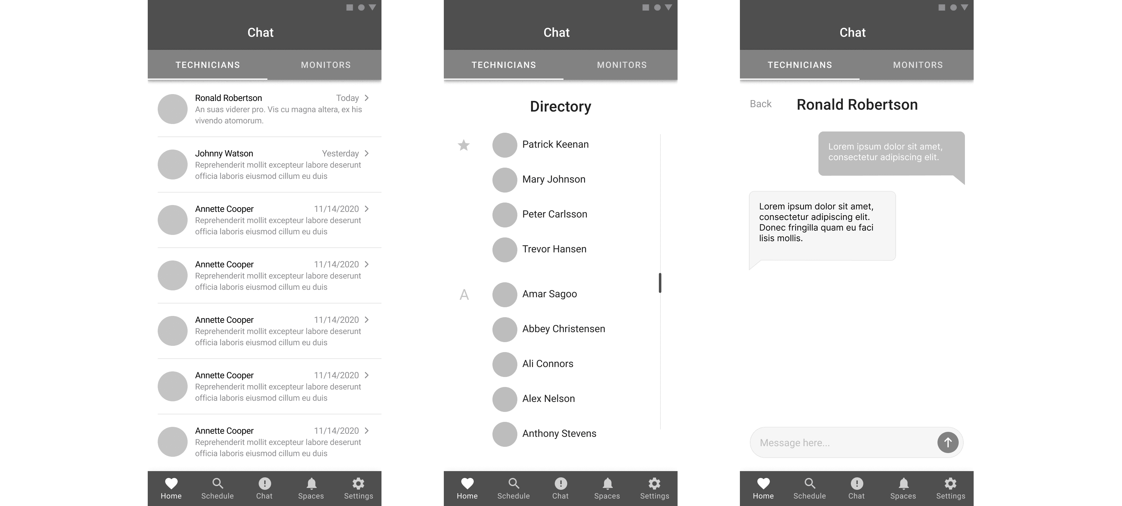
After incorporating user feedback from my sketches, I transitioned into Figma where I started creating grayscale wireframes to examine content hierarchy and to further iterate through ideas and solutions.
Throughout this step of the process, I was deep diving into creating a system of metrics to easily view information and codify the reservation process. The reasoning behind this idea was to further explore the concept of flexibility and spontaneity behind scheduling changes.
Situations of reservation cancellations, changes, and extensions exist; how could I effectively consider these contexts in the position of a busy student? I explored various UI design patterns and interactions such as sliders, progress bars, and drop-downs. Subsequently, regular feedback from peers and user testing participants on my reservation concepts helped to inform the final prototype outcome.
Grayscale Wireframes
UI Explorations
Visual Identity: Expanding on the Existing Branding
When developing the visual identity of this app, it was relevant to build upon the existing branding of the Sam Fox School. By extending the school's color palette and design language, I aimed to create an updated and modern visual experience. This approach ensures consistency with the existing brand while instilling contemporary aesthetics into the visual design.
To ensure consistency and efficiency, I leveraged an existing design system when building out the designs. Using Material Design principles, I utilized pre-existing design patterns to allow for experimentation and cascading changes. This approach streamlined the design process, ensuring efficiency and maintaining a unified visual experience at scale.
Moreover, I aimed to evoke a friendly and approachable tone for users. This was extended to the language and copywriting of the app for consistency and to guide users to make meaningful decisions.

Part 04
User Test & Iterate
User Feedback: Old and New Participants
With the goals and revisions I had in mind, our class conducted user feedback sessions with new and familiar participants over the course of three weeks. It was a combination of those who held blind expectations and were not a part of the SFS community as well as SFS members who held different attitudes towards a reservation system
The following is a brief overview of my process involved using retrospective probing and think-aloud protocol methods to gather a deeper understanding of mental models and behaviors.
User Testing: First Phase
Introduce the project and relevant context.
Ask the participant to perform a series of tasks.
Let the participant screen share and use the working prototype while thinking aloud.
Ask follow-up questions, gather feedback, and thank them for their time.
User Testing: Second Phase
Introduce the project and relevant context.
Let the participant screen share and allow the participant to freely explore the prototype.
Ask the participant to walkthrough what they did and why, and talk about any other parts of the interface they considered.
Ask follow-up questions, gather feedback, and thank them for their time.
Design Iterations and Findings
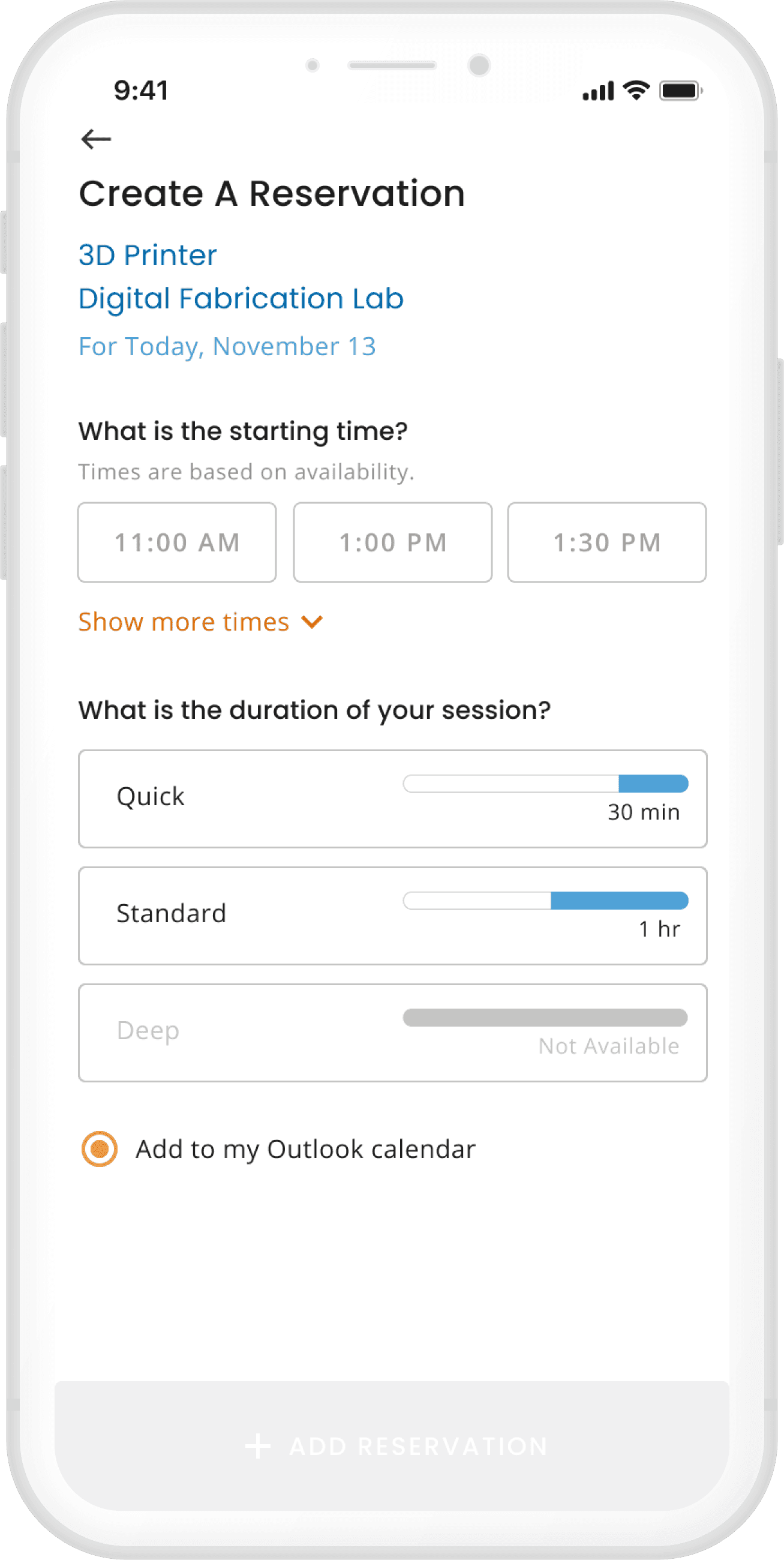
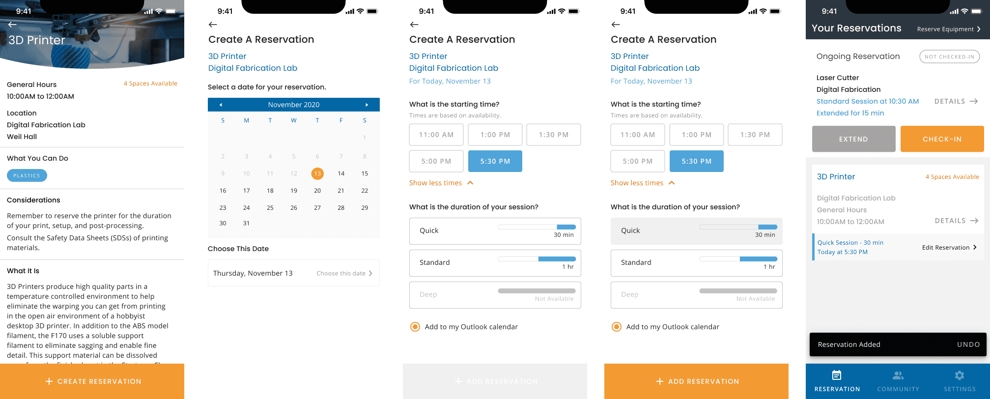
One of the significant revisions to my designs focused on refining the process of creating and extending reservations. Through user testing sessions and feedback from peers, it became evident that many users encountered difficulties in finding an available reservation.
To avoid users feeling frustrated in continually guessing and searching for open slots, I revised the design for the starting time selection to feature fewer granular units of time. By doing so, this adjustment simplified the scheduling process within the reservation system, enabling users to create reservations more easily.
Another valuable insight gained from user testing was that when extending a reservation, establishing a standardized system helped avoid unnecessary complexities. By implementing a formal framework, I aimed to improve customization and flexibility to make it more intuitive for users. This approach aimed to enhance adaptability and efficiency for users seeking to extend their reservations.
For extending a reservation, I had to keep in mind that one of my goals was to create a positive experience. Here, I learned that using the extend function could articulate a user’s needs in a reservation and account for unexpected changes in a schedule.
How could I guide the user to very rarely encounter an error state?
Arriving at the Final Design Prototype
For my final prototype, I kept in mind my goals, user needs, and feedback from user testing to refine and improve the solutions I prioritized.
The result is a comprehensive and adaptable system that cultivates a positive reservation experience, enhances efficiency, and establishes improved information clarity. These improvements directly address the problems and user pain points discovered at the start of this project.
The final interactive design prototype can be accessed here.
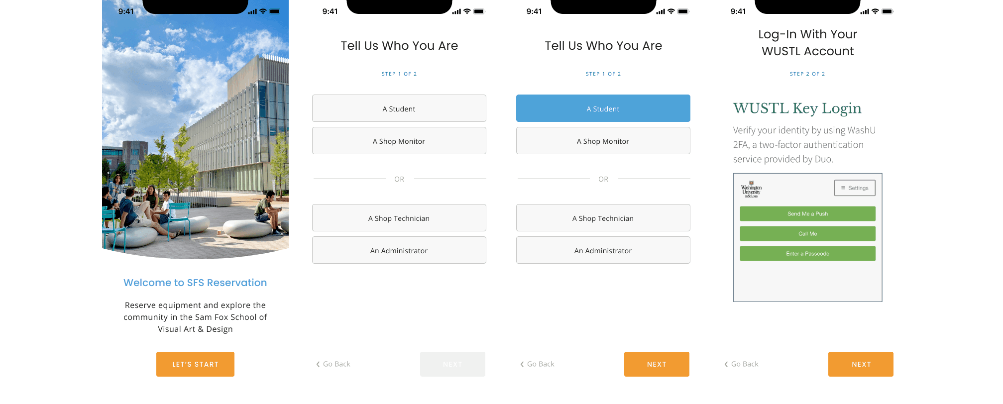
New User Onboarding Flow
Browse and Filter Flow
Create New Reservation Flow
Extend Reservation Flow
Change Reservation Flow
SFS Community and Chat Flow
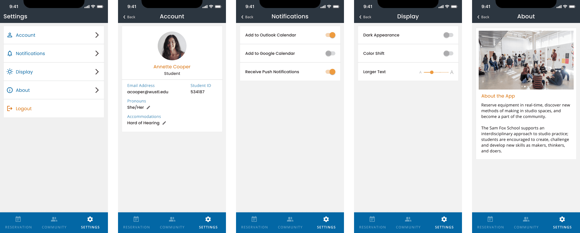
Settings and Accessibility Flow
Part 05
Evaluate
How This App Addresses The Problem
01
Providing a flexible and efficient system
The goal of improving coordination between students and shop technicians in light of the unpredictable changes in studio shops has been addressed through the development of a flexible and adaptive system. For example, the experience enables students to easily access updated information about equipment availability, schedule changes, and shop protocols. At the same time, shop technicians and monitors can utilize the system to manage reservations, communicate important updates, and ensure a smooth workflow.
02
Reducing negative emotions and barriers
Creating an environment where students feel comfortable and encouraged to explore new equipment and spaces is essential. By cultivating a welcoming atmosphere and promoting inclusivity through the mobile app's visual design, students can feel empowered to engage with different shop spaces, thereby enhancing their learning experience and allowing them to effectively utilize multiple tools across various areas.
03
Encouraging discoverability and exploration
A recognizable, simple, and clear experience allows complex and tedious information to become more easily digestible. By implementing intuitive design elements such as visual cues, clear navigation, and concise labeling, users can quickly comprehend and navigate through new information seamlessly.
How might I design a visualized reservation system that allows for information visibility and consistent communication across multiple studio spaces?
Closing Thoughts and Takeaways
I learned new insights, methodologies, and practices that I will take with me and apply in future projects. Throughout the process, I wanted to give many thanks to my professor, participants, and guests from the Sam Fox School and Google that gave their time to provide valuable feedback and user test my prototype. The final prototype was positively received by users and peers; people commented on how robust and well-considered the features were to provide solutions to students. If I were to continue working on this app, I would love to conduct a round of usability testing to further stress test the outcome of my informed design solutions.
Targeting user needs and project goals the most efficiently and effectively during user testing shifted how I rethought and iterated through multiple variations of design solutions. The biggest surprise for me was continually revising the details; I came into this project thinking that the feedback I would receive would be on larger-scale features that included suggestions on new features, but it made me realize that the details were what created a robust and positive experience for a user.
Thanks for reading!


