Part 01
Overview
Highspot is a sales enablement platform used by sales teams and organizations to better drive strategic growth. The enterprise software’s main use cases are to manage content, guide sellers, train & onboard, coach reps, and engage customers.
I was brought onto the Information Services team to expedite and elevate existing product features. The Information Services team is a relatively new team that was created last year to help align horizontal product experiences in the Highspot app such as search, support & nurturing, content guidance & governance, settings, and analytic tools.
During my time, I supported the team with a new initial version of a help and support experience, an updated version of promoted search feature flows, and miscellaneous design asks.
Overview of Design Involvement
The main challenge I faced was navigating a resource-constrained environment. As a contractor, my access to resources, internal features, and direct user interaction was limited. To overcome these constraints, I sought communication and input from senior designers, leveraging their experience to gain a better understanding of the Highspot product. Additionally, I relied on previous design files to inform my design decisions and maintain coherence with the design system.
01
Conceptualized a new help and support experience
I designed multiple directions for Project Wayfinder, an updated user nurturing and help experience within the Highspot app. I explored and iterated through help and support UX models to identify potential design solutions, aiming to increase retention metrics and align with Highspot's strategic goals.
02
Prototyped user flows for V2 Promoted Search in admin settings
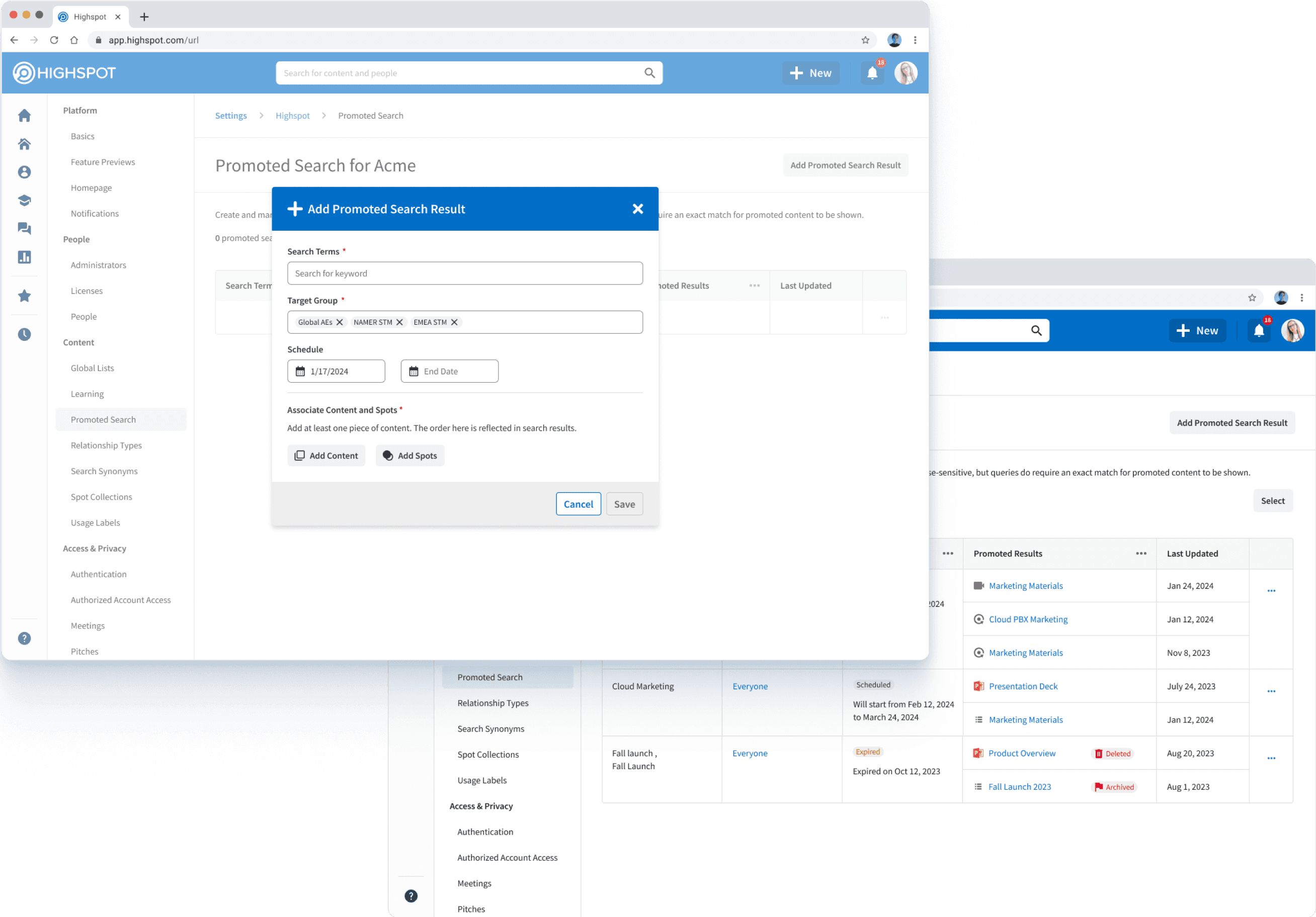
I owned the design efforts for V2 Promoted Search, creating new admin features and user interactions. I annotated the design flows for development and documented new components and interactions, ensuring clear understanding and implementation with development.
Project Wayfinder
Promoted Search
Part 02
Project Wayfinder
I dived into Project Wayfinder by first understanding the current help and support experience through customer research and insights gathered by the PM and user research team.
01
Inaccessible self-service resources
Highspot’s extensive range of self-service resources is currently inaccessible to customers. They can only search Zendesk Help Articles via the Help widget, leaving a significant amount of valuable content undiscovered. As a result, customers are often unaware that various help and support content exists.
02
Fragmented and weak help center experience
The current help center navigates customers away from the Highspot app to external Help Center pages. To enable quicker unblocking and a seamless return to their activities, customers should be able to self-serve within the Highspot environment. Integrating search, navigation, and content usage within the Highspot experience is crucial for achieving this goal.
03
Limited support interface
The current support UI limits the data provided to the Support Team, complicating issue troubleshooting. Customers cannot attach files or provide detailed information when filing a support ticket, leading to increased back-and-forth communication, longer Average Resolution Times (ART), and higher support costs.
04
Overdependence on direct customer support
When customers give up on self-service options, they contact support directly, wasting significant Support Team time and resources. This approach is inefficient and costly. Enhancing the self-service capabilities within the Highspot app would reduce the dependency on direct support, allowing the Support Team to focus on more complex issues and improving overall customer satisfaction.
My Design Process
Drawing from the insights gained from understanding the context and customer problem, I applied three design principles to guide my design process. These principles helped clarify my end goals and make sure I was addressing the problem at a high level.
The overall focus was to ensure my solutions were customer-centric and aligned with Highspot's strategic goals.
The project had two main goals. The first was to create a centralized, updated help and support experience that allows users to access various Highspot self-service resources. This aimed to reduce the number of support tickets for the Customer Support team, increase the adoption of self-service resources, and cultivate more "trained" customers. The second goal was to make in-context support more relevant within the Highspot app, enabling users to resolve issues more quickly, ultimately enhancing retention and success metrics.
The Design Goals

There are three personas that represent the main use cases of Highspot’s Help & Support experience. This was synthesized from insights gathered by the Customer Learning Team and the Support Team to best guide a informed and user-centric design solution.
01
The publisher
Publishers manage and organize content within Highspot. This persona requires tailored resources to efficiently navigate their roles. Therefore, they need easy access to a variety of self-serve resources such as Highspot University courses, SmartPages, Chameleon tours, enablement success content, Quicktake videos, and relevant articles.
02
The sales representative
Sales representatives need quick, precise information to engage buyers. This persona requires robust search functionality within Highspot, allowing them to successfully find answers. By searching for specific queries, they should access instant answers, Highspot University courses, Chameleon tours, Quicktake videos, and help articles.
03
The solution owner
Solution owners handle technical issues and ensure smooth operations within Highspot. They need efficient troubleshooting resources and the ability to submit detailed support tickets. When encountering problems such as trouble enrolling users, they can search for solutions through help articles and videos. If the search results do not address their issue, they should have the option to submit a support ticket to the Support Team.
User Personas for Help & Support

The Publisher
Focuses on a browsing experience

The Sales Rep
Focuses on a searching experience
The Solution Owner
Focuses on a troubleshooting experience
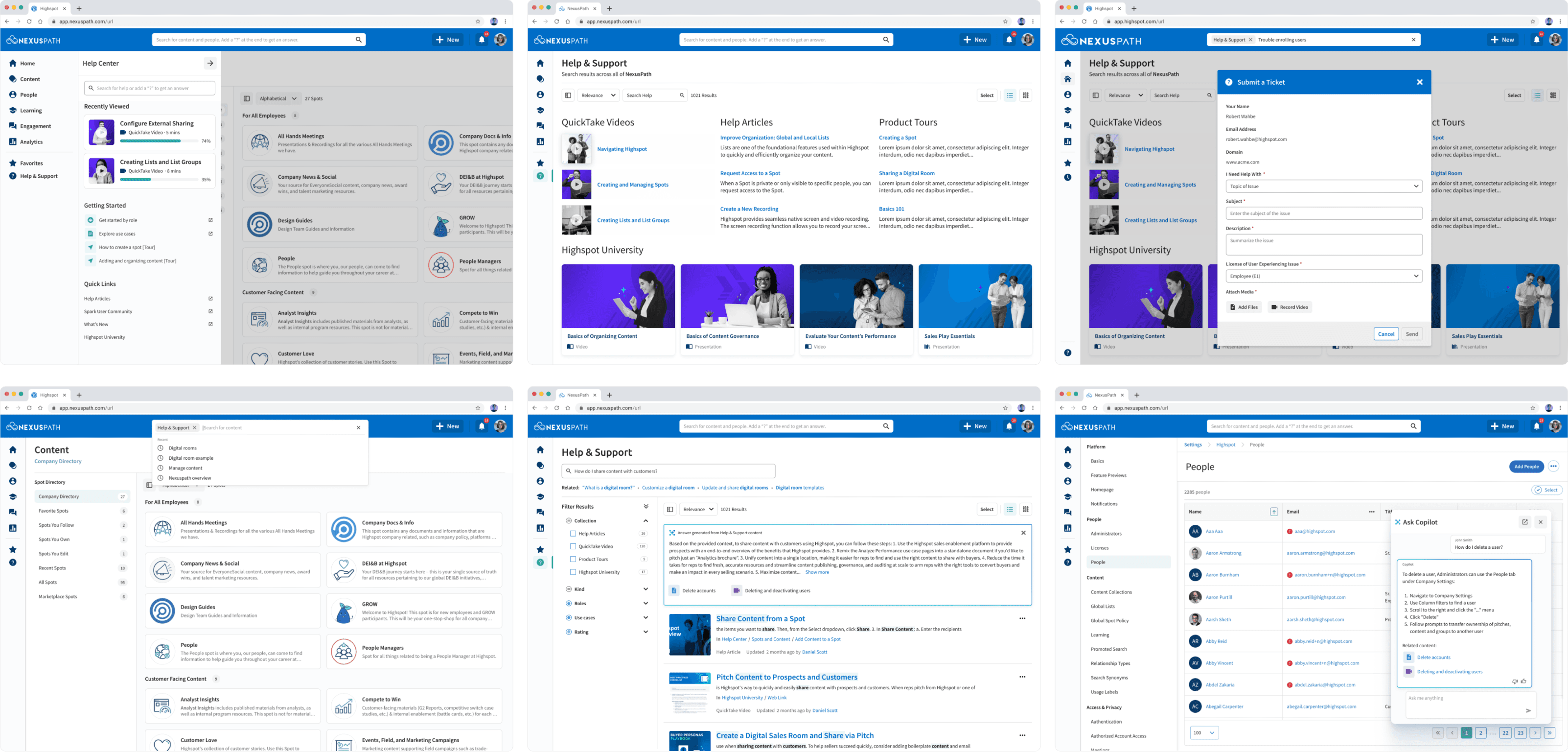
My work led to three main ideas for improving the help and support experience. The first idea was to make support more contextual, providing help right where users need it. The second idea was designing a help library, offering easy access to a wide range of self-service resources. The third idea was to integrate the customer help experience with the universal search bar, making it easier for users to find support materials across the platform. These user nurturing models aimed to increase Highspot’s user retention, NPS, and CSAT metrics.
Since the project wasn't completed during my time at Highspot, I can't show the full extent of my design work. However, these design directions provided a solid plan for improving the Help & Support experience for customers.
Sample of Designs
Part 02
Promoted Search V2
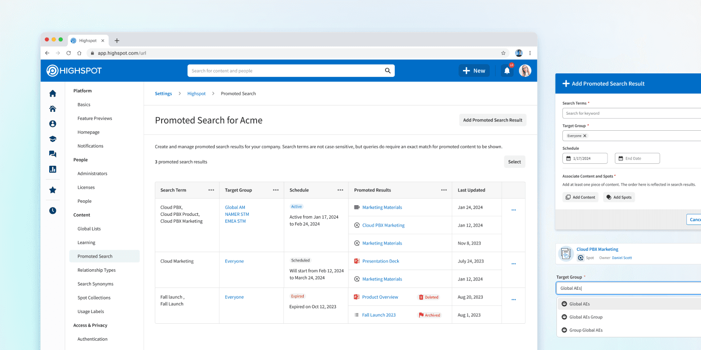
Promoted Search is a valuable Highspot feature that allows Solution Owners to promote specific pieces of content to appear at the top of search results as "promoted" for defined search query terms. This feature is crucial for Highspot Solution Owners as it helps influence search results and guide Sales Reps to the most relevant content based on their queries.
Moreover, there are multiple feature requests that align with the problems customers encounter with the current experience. My efforts focused on addressing these pain points to improve the usability and effectiveness of Promoted Search.
01
Expand Promoted Search to cover additional user scenarios
A primary goal is to broaden the functionality of Promoted Search to address a wider range of admin needs. This involves handling various search campaign scenarios and ensuring relevant results for a broader set of queries. Enhancing the admin back-end will also improve the ranking algorithm in Search, providing more relevant and useful results.
02
Improve the ease-of-use of Promoted Search
Another goal is to simplify the process of using Promoted Search terms to ensure a more intuitive user experience. This includes making it easier for users to navigate and utilize Promoted Search functionalities. Additionally, providing admins with the tools they need to curate the search experience for their domain based on unique business needs will enhance overall usability and CSAT.
03
Enable more targeted campaigns for admins
Another key objective is to allow admins to create more precise and effective search campaigns by targeting specific user groups and setting campaign durations. This involves defining scoped user groups based on various criteria and providing the ability to set start and end dates for campaigns. These features will ultimately drive higher engagement and better outcomes for specific user segments.
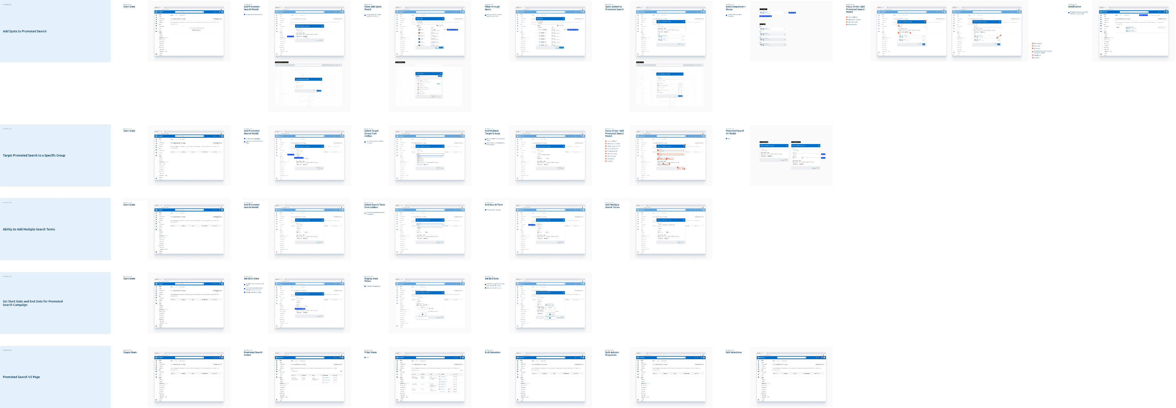
Following the design goals, I designed and prototyped user flows for five new V2 features intended for Fall release. Furthermore, I documented new design components and user interactions, such as selecting multiple search terms and date picker interactions, which were previously not in place.
Since the project wasn't fully delivered during my time there, I can't reveal the full scope of my design work. However, the work I did was important for future development and product alignment.
Snapshot of V2 Promoted Search Features
Part 03
Takeaways
01
Ensuring pattern coherence with a mature design system
Working within Highspot’s detailed design system required understanding its application and creating new designs and interactions that fit within its patterns. I navigated discrepancies in components as the design and team evolved, learned best practices behind design patterns, and ensured consistent application across my work.
02
Guiding my designs with principles and frameworks
I learned how Highspot’s design principles were essential in informing solutions and serving customer needs. It was important to think big picture and approach problems holistically, intentionally, and specifically. Applying these principles and frameworks allowed me to create solutions that were both creative and aligned with long-term goals.
03
Embracing an unfamiliar design environment
I gained experience navigating new design processes, which challenged me in unexpected ways. The Highspot design environment emphasized leading with principles to produce high-quality UX that scales efficiently. Feedback sessions with senior designers provided valuable learning opportunities, enhancing my knowledge and validating my designs.
Thanks for reading!

